The Global Burden of Disease (GBD) study provides a comprehensive summary of global disease burdens every year by estimating the years of life lost to each disease. This project began as a World Health Organization (WHO) initiative in 1990, and went through a major update in 2010. The Institute for Health Metrics and Evaluation (IHME) played a leading role in the most recent update, organizing over 1600 GBD collaborators from 16 countries.
One interesting tool that they built is the GBD Compare visualization for viewing and interacting with the data. This tool is especially helpful for comparing the scale of different public health problems, and how they relate to one another. For example, here is a re-creation of one of their visualizations using D3.js, showing the total Disability Adjusted Life Years (DALY) burden by year for the world population:
The rest of this post looks at a few other disease burdens that it might make sense to add to the GBD analysis.
First, I think they should add the annualized burden of pandemic diseases to the study. Second, it might make sense to increase the reference life expectancy so that years of life lost due to future increases in the life expectancy are incorporated into the estimates. I provide the computations and graphics to visualize the scale of each one of these new burdens below. All of the code for this post is available in a Jupyter notebook here.
Importing the Data
All of the data for this post can be accessed by visiting the visualization and clicking the download button in the upper right corner. I obtained the life table that I use later from the Web Table 6 of the supplementary appendix: PDF. The CSVs are also available as a zipped file here.
The Plotting Function
Below, I create a plotting function to re-create a view of the GBD Compare tool, showing the total DALY burden per year, separated into cause areas. Note that you can see a general trend downwards, and the red area of infectious disease is shrinking with time.
As the burden of infectious disease is declining, chronic diseases often associated with old age in high income countries are increasing. Note that this plot is showing absolute numbers, so the fact that the overall DALY burden is declining even as the population is growing is pretty encouraging.
colors = ["#006D2C", "#31A354","#74C476", "#BAE4B3", "#54278F", "#756BB1",
          "#9E9AC8", "#BCBDDC", "#DADAEB", "#08519C", "#3182BD",
          "#6BAED6", "#9ECAE1", "#C6DBEF", "#99000D", "#CB181D",
          "#EF3B2C", "#FB6A4A", "#FC9272", "#FCBBA1", "#FEE0D2",
          '#ffff80','#ffffcc']

def stacked_plot(gbd_df, width, ylim, colors):

    fig, ax = plt.subplots(figsize=(17,10))  #(20,12)

    causes = gbd_df['Cause of death or injury'].drop_duplicates()

    # http://stackoverflow.com/questions/19060144
    # Keep track of bottom margin for each stack row/year
    margin_bottom = np.zeros(len(gbd_df['Year'].drop_duplicates()))

    for num, cause in enumerate(causes):
        values = list(gbd_df[gbd_df['Cause of death or injury'] == cause].loc[:, 'Value'])
        label = textwrap.fill(cause, 30)

        gbd_df[gbd_df['Cause of death or injury'] == cause].plot.bar(
                x='Year',y='Value', ax=ax, stacked=True, color=colors[num], label=label,
                bottom = margin_bottom, width=width)

        margin_bottom += values

    #http://stackoverflow.com/questions/4700614/how-to-put-the-legend-out-of-the-plot
    #Shrink current axis by 20%
    box = ax.get_position()
    ax.set_position([box.x0, box.y0, box.width * 0.8, box.height])

    #Put a legend to the right of the current axis
    ax.legend(loc='center left', bbox_to_anchor=(1, 0.5))

    ax.set_ylabel('DALYs, Global (billions)')
    ax.set_ylim([0, ylim])

    plt.show()

stacked_plot(gbd_df, 0.85, 3.0e9, colors)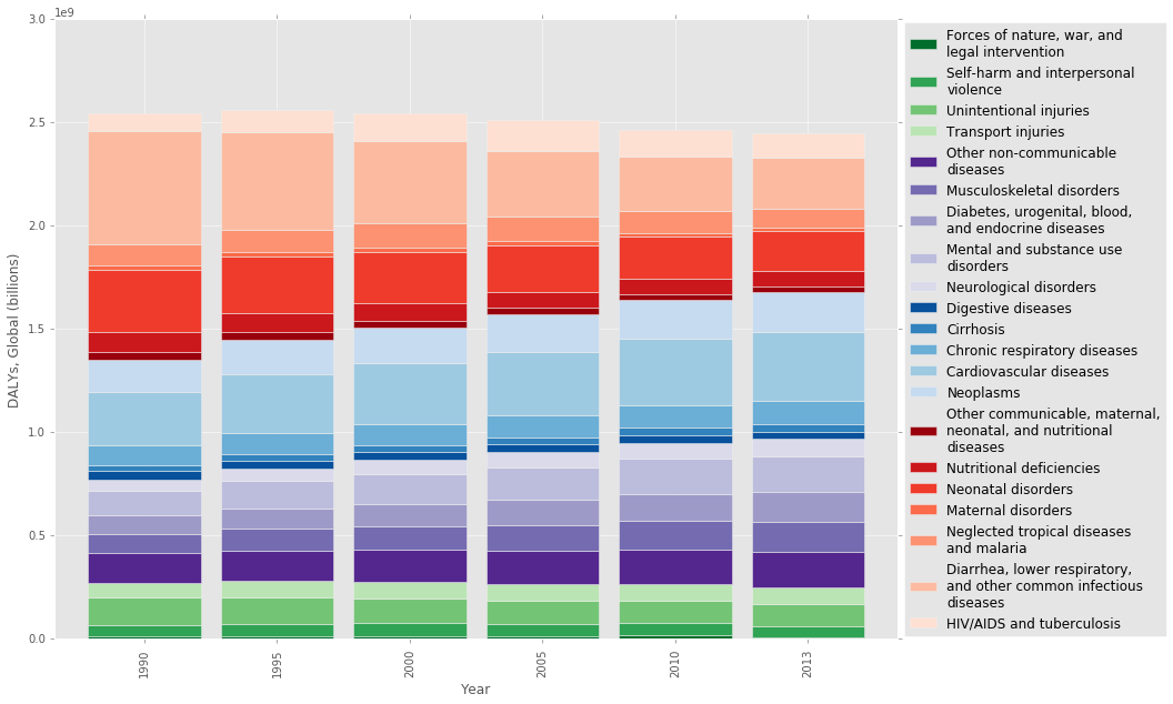
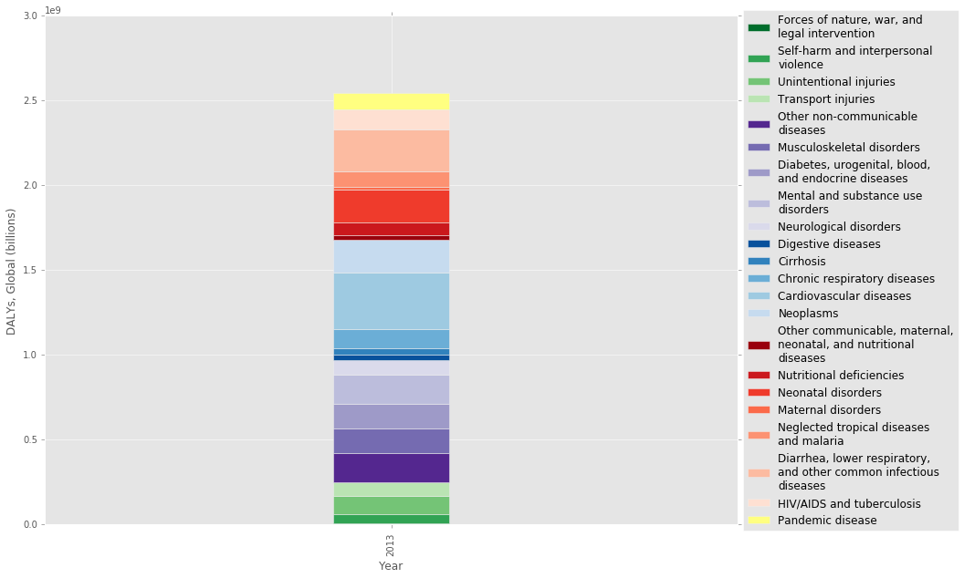
How would including pandemic disease risk change the picture?
I recently read a paper called The Neglected Dimension of Global Security: A Framework to Counter Infectious Disease Crises [1], which looked at the risk of a global pandemic disease and called for a number of policy changes to increase our preparedness. It’s pretty surprising how little emphasis we put on pandemic disease risk, given the potential health and economic costs. So I was interested in adding an annualized DALY (YLL only) burden to the plot to get a feel for the relative scale of the problem.
First, I obtained an annual risk of pandemic outbreak from the paper [1], which they put at 3 percent per year (Appendix C). This is based on the 20th century rate, which had pandemic outbreaks in 1918, 1957 and 1968. The authors also make the point that the risk of a pandemic is increasing with time, so this 3 percent may be an underestimate. I obtained a mean age of death from a study that looked at the 2009 the A/H1N1 outbreak [2], and found an estimate from the 1918-20 spanish flu pandemic to use as the excess mortality figure [3].
As you can see in the table at the end, pandemic disease has a similar annual burden to that of Neglected tropical diseases and malaria, at 92 million DALY/year. This isn’t as large as I thought it would be, but it’s important to keep in mind that pandemics happen all at once, which would essentially double the global mortality figures in a single year [2]. Pandemics also cause massive social, economic, and political disruption resulting in other costs beyond human health. One estimate puts the annualized economic cost of a pandemic disease outbreak at $60 billion [1].
# Pandemic disease annualized burden

annual_probability = 0.03
life_table_37 = 49.58 #Years remaining in life, from GBD life table below
excess_mortality = 62000000

#Use life table, don't incorporate potential years up to 100, etc.
pandemic_yll = life_table_37 * excess_mortality * annual_probability
#Annualized years of life lost due to pandemics (billions):  0.0922188

print 'Annualized years of life lost due to pandemics (billions): ', pandemic_yll/ 1e9

gbd2013_df = gbd_df[gbd_df['Year'] == 2013]
pandemic_df = gbd2013_df.copy()
pand_dict = [{'Cause of death or injury': 'Pandemic disease', 'Year': 2013, 'Value': pandemic_yll}]
pandemic_df = pandemic_df.append(pand_dict, ignore_index=True)

stacked_plot(pandemic_df, 0.1, 3.0e9, colors)
Annualized years of life lost due to pandemics (billions): 0.0922188
What if we use a longer life expectancy as the reference?
In order to calculate DALYs, you need two numbers: the years of life lost (YLL) and the years lived with disability (YLD). In order to calculate YLL for an individual, you need to know their age at death and their life expectancy at that age.
But which life expectancy should you use? In past studies, the life expectancy of a male or female within the individual’s country at that age was used. In my view, this most recent study is an ethical improvement because it uses Japanese women, who have the longest life expectancy at 86, as the standard to compare everyone against [4]. By doing this, the authors are saying that every person should have the longest possible life expectancy regardless of their location or sex.
But do Japanese women really have the longest life expectancy? As a group with a population that is over 5 million, they do. But we certainly know that it is biologically possible to live much longer than this. Why not set the upper limit at what is currently biologically possible?
One reason might be that a substantial portion of longevity could be due to genetic predisposition. Some estimates put the genetic portion at 20-30% but this might be complicated by epigenetics and gene-environment interactions and might increase in cases of extreme longevity [5]. But at the end of the day, genetic predisposition results in some type of gene expression in the body that we could mimic if we had a better understanding of the aging process. Also, note that the study authors are already ignoring genetic predisposition by using Japanese women as the comparison group.
Another argument against the extended life expectancy is that people are expressing their preference to live a shorter life by choosing a less healthy lifestyle (people like eating bacon). I think this is a stronger criticism, but it’s important to note that people aren’t always rational when it comes to long term decision making. Also, plenty of other disease burdens that are due to conscious decisions (e.g. smoking) are included in the DALY estimates.
Anyways, the purpose of this article isn’t to hash out every ethical consideration – I just want to get a sense of the scale of the potential disease burden. So how would using a life expectancy of, say, 100 change the analysis? Below I use two methods, one a simple estimate, and a second more in-depth estimate using life tables and global deaths by age. The end result is that using a life expectancy of 100 would result in an extra disease burden of around 500 million YLL due to premature aging each year.
Simple Estimate
# Aging annualized burden, simple estimate
annual_death_rate = 765.73/100000 #GBD 2013
potential_expectancy = 100
global_population = 7125000000  #2013, World Bank
gbd_expectancy = 86


#Annual potential years of life lost, estimate
aging_yll_est = (potential_expectancy - gbd_expectancy) * annual_death_rate * global_population

print 'Years lost due to premature aging, simple estimate (billions): ', aging_yll_est / 1e9
#Note it ignores any YLDs
Years lost due to premature aging, simple estimate (billions): 0.763815675
Life Table Estimate
The second approach accounts for the fact that after you’ve lived through younger age cohorts, your current life expectancy actually exceeds your life expectancy at birth. This is why someone at age 105 in the life_table below can still expect to live 1.63 more years even if this exceeds their life expectancy at birth. Of the people that reach that age, the average length of life afterwards is 1.63 years. Ok, so how do we take that into account?
The GBD already used the age in the life table plus the remaining years of life when they calculated YLL [6]. So I need to subtract this sum from the new upper limit of 100 years for each age cohort, and multiply that result times the number of deaths in each age cohort in 2013. The deaths by age group data from IHME’s site comes grouped by five year increments, so I use the mean life table value for the five year cohorts to do the analysis.
# Aging annualized burden, life table estimate

# Comprehensive Systematic Analysis of Global Epidemiology: Definitions, Methods,
# Simplification of DALYs, and Comparative Results from the Global Burden of Disease 2010 Study
# Web Table 6: Single year standard lifetable
life_table = {0: 86.02, 1: 85.21, 2: 84.22, 3: 83.23, 4: 82.24, 5: 81.25, 6: 80.25, 7: 79.26,
             8: 78.26, 9: 77.27, 10: 76.27, 11: 75.28, 12: 74.28, 13: 73.29, 14: 72.29, 15: 71.29,
             16: 70.3, 17: 69.32, 18: 68.33, 19: 67.34, 20: 66.35, 21: 65.36, 22: 64.37, 23: 63.38,
             24: 62.39, 25: 61.4, 26: 60.41, 27: 59.43, 28: 58.44, 29: 57.45, 30: 56.46, 31: 55.48,
             32: 54.49, 33: 53.5, 34: 52.52, 35: 51.53, 36: 50.56, 37: 49.58, 38: 48.6, 39: 47.62, 40:
             46.64, 41: 45.67, 42: 44.71, 43: 43.74, 44: 42.77, 45: 41.8, 46: 40.85, 47: 39.9, 48: 38.95,
             49: 38.0, 50: 37.05, 51: 36.12, 52: 35.19, 53: 34.25, 54: 33.32, 55: 32.38, 56: 31.47,
             57: 30.55, 58: 29.64, 59: 28.73, 60: 27.81, 61: 26.91, 62: 26.0, 63: 25.1, 64: 24.2, 65: 23.29,
             66: 22.42, 67: 21.55, 68: 20.68, 69: 19.8, 70: 18.93, 71: 18.1, 72: 17.28, 73: 16.45, 74: 15.62,
             75: 14.8, 76: 14.04, 77: 13.27, 78: 12.51, 79: 11.75, 80: 10.99, 81: 10.32, 82: 9.65, 83: 8.98,
             84: 8.31, 85: 7.64, 86: 7.12, 87: 6.61, 88: 6.09, 89: 5.57, 90: 5.05, 91: 4.7, 92: 4.35, 93: 4.0,
             94: 3.66, 95: 3.31, 96: 3.09, 97: 2.88, 98: 2.66, 99: 2.44, 100: 2.23, 101: 2.11, 102: 1.99,
             103: 1.87, 104: 1.75, 105: 1.63}

#The mean of life_table for each year range
life_table_5yr = {'60-64': 26.0, '25-29': 59.43, '50-54': 35.19, '90-94': 4.35, '100-104': 1.99,
                  '75-79': 13.27, '10-14': 74.28, '95-99': 2.88, '15-19': 69.32, '20-24': 64.37,
                  '1-4': 83.725, '65-69': 21.55, '55-59': 30.55, '40-44': 44.71, '45-49': 39.9,
                  '30-34': 54.49, '35-39': 49.58, '5-9': 79.26, '70-74': 17.28, '0-1': 86.02,
                  '80-84': 9.65, '85-89': 6.61, '80-105': 4.96}

years = life_table_5yr.keys()
values= life_table_5yr.values()
life_df = pd.DataFrame({'Age': years, 'avg_lost_years': values })


deaths_df = pd.read_csv('./gbd_deaths_age_2013.csv')
deaths_df = deaths_df[['Age', 'Value']]
deaths_df.replace([' years', ' days', '\+'], ['','','-105'], regex=True, inplace=True)
deaths_df = deaths_df.append({'Age': '0-1', 'Value': np.sum(deaths_df.ix[0:2,'Value'])}, ignore_index=True)
deaths_df.drop(deaths_df.index[[0,1,2]], inplace=True)
deaths_df['lower_age'], deaths_df['upper_age'] = deaths_df['Age'].str.split('-').str
deaths_df[['lower_age','upper_age']] = deaths_df[['lower_age','upper_age']].apply(pd.to_numeric)
deaths_df['avg_age'] = (deaths_df['upper_age'] + deaths_df['lower_age']) / 2
deaths_df.rename(columns={'Value':'num_deaths'}, inplace=True)

deaths_df = deaths_df.merge(life_df, on='Age')
deaths_df['age_cohort_lifeexp'] = deaths_df['avg_age'] + deaths_df['avg_lost_years']


# Potential_expectancy is from simple estimate:
deaths_df['aging_yll'] = (potential_expectancy - deaths_df['age_cohort_lifeexp']) * deaths_df['num_deaths']

aging_yll = np.sum(deaths_df['aging_yll'])

# Add on additional potential years from pandemics, based on new potential expectancy:
# No pandemics: 0.527058402523, with: 0.552019602523
aging_yll += (potential_expectancy - (mean_age + life_table_37)) * excess_mortality * annual_probability

print 'Years lost due to premature aging, life table estimate (billions): ', aging_yll / 1e9

deaths_df.sort_values(by='lower_age')
Years lost due to premature aging, life table estimate (billions): 0.552019602523
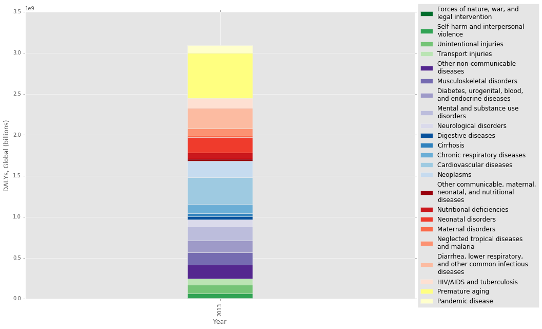
What’s the relative scale?
Finally, here is an updated visualization and table showing the added YLL due to premature aging. The premature aging column turns out to be quite large. Should this column actually just be split up among all the different causes of death? To answer this question, we need to know if aging is just the cumulative effect of many independent diseases, or if it is a biologically unique process that can be targed independently. I think the answer to this question is still elusive.
The final table below shows that the Pandemic disease burden is in the middle, with a similar value to that of Neglected tropical diseases and malaria.
#colors_update = colors[:]
#colors_update.extend(['#ffff80','#ffffcc'])  #['#ffff80','#ffffcc']  [ '#A9A9A9', '#BFBFBF']

dicts = [{'Cause of death or injury': 'Premature aging', 'Year': 2013, 'Value': aging_yll},
         {'Cause of death or injury': 'Pandemic disease', 'Year': 2013, 'Value': pandemic_yll}]

gbd2013add_df = gbd2013_df.copy()
gbd2013add_df = gbd2013add_df.append(dicts, ignore_index=True)

stacked_plot(gbd2013add_df, 0.1, 3.5e9, colors)

gbd2013add_df.sort_values(by='Value')
| Location | Year | Age | Sex | Cause of death or injury | Measure | Value | Lower bound | Upper bound | |
|---|---|---|---|---|---|---|---|---|---|
| 0 | Global | 2013 | All ages | Both | Forces of nature, war, and legal intervention | DALYs | 6.113613e+06 | 3.504764e+06 | 1.106874e+07 |
| 17 | Global | 2013 | All ages | Both | Maternal disorders | DALYs | 1.802781e+07 | 1.605184e+07 | 1.998946e+07 |
| 14 | Global | 2013 | All ages | Both | Other communicable, maternal, neonatal, and nutritional diseases | DALYs | 2.711404e+07 | 2.168406e+07 | 3.397773e+07 |
| 10 | Global | 2013 | All ages | Both | Cirrhosis | DALYs | 3.685807e+07 | 3.505394e+07 | 3.902250e+07 |
| 9 | Global | 2013 | All ages | Both | Digestive diseases | DALYs | 3.734117e+07 | 3.367044e+07 | 4.145244e+07 |
| 1 | Global | 2013 | All ages | Both | Self-harm and interpersonal violence | DALYs | 5.657462e+07 | 4.867773e+07 | 6.325653e+07 |
| 15 | Global | 2013 | All ages | Both | Nutritional deficiencies | DALYs | 7.483442e+07 | 5.940201e+07 | 9.408409e+07 |
| 3 | Global | 2013 | All ages | Both | Transport injuries | DALYs | 7.895289e+07 | 7.212276e+07 | 8.511561e+07 |
| 8 | Global | 2013 | All ages | Both | Neurological disorders | DALYs | 8.404802e+07 | 6.569416e+07 | 1.056925e+08 |
| 18 | Global | 2013 | All ages | Both | Neglected tropical diseases and malaria | DALYs | 9.067684e+07 | 7.574893e+07 | 1.077376e+08 |
| 22 | NaN | 2013 | NaN | NaN | Pandemic disease | NaN | 9.221880e+07 | NaN | NaN |
| 2 | Global | 2013 | All ages | Both | Unintentional injuries | DALYs | 1.059413e+08 | 9.699608e+07 | 1.172652e+08 |
| 11 | Global | 2013 | All ages | Both | Chronic respiratory diseases | DALYs | 1.127107e+08 | 9.887194e+07 | 1.281478e+08 |
| 20 | Global | 2013 | All ages | Both | HIV/AIDS and tuberculosis | DALYs | 1.191796e+08 | 1.124977e+08 | 1.275849e+08 |
| 6 | Global | 2013 | All ages | Both | Diabetes, urogenital, blood, and endocrine diseases | DALYs | 1.416209e+08 | 1.187134e+08 | 1.681583e+08 |
| 5 | Global | 2013 | All ages | Both | Musculoskeletal disorders | DALYs | 1.494357e+08 | 1.068885e+08 | 1.975651e+08 |
| 4 | Global | 2013 | All ages | Both | Other non-communicable diseases | DALYs | 1.709479e+08 | 1.309229e+08 | 2.234843e+08 |
| 7 | Global | 2013 | All ages | Both | Mental and substance use disorders | DALYs | 1.731774e+08 | 1.274265e+08 | 2.217341e+08 |
| 16 | Global | 2013 | All ages | Both | Neonatal disorders | DALYs | 1.896010e+08 | 1.790241e+08 | 2.000440e+08 |
| 13 | Global | 2013 | All ages | Both | Neoplasms | DALYs | 1.970935e+08 | 1.892370e+08 | 2.062585e+08 |
| 19 | Global | 2013 | All ages | Both | Diarrhea, lower respiratory, and other common infectious diseases | DALYs | 2.498551e+08 | 2.312221e+08 | 2.696253e+08 |
| 12 | Global | 2013 | All ages | Both | Cardiovascular diseases | DALYs | 3.297056e+08 | 3.111888e+08 | 3.482062e+08 |
| 21 | NaN | 2013 | NaN | NaN | Premature aging | NaN | 5.520196e+08 | NaN | NaN |
Conclusion
I think back of the envelope calculations like these can be helpful for thinking about the relative scale of problems. I don’t have a background in public health or epidemiology so these are really rough estimates, but I think they’re at least in the right ballpark.
While these numbers are interesting, I don’t think they go far enough because they don’t include cost effectiveness estimates. This is what I think the Neglected Dimensions paper [1] and the advocates of anti-aging research are getting at. They’re not just saying these are big problems. They’re also saying that there are better opportunities for society to make investment in these areas relative to other areas, largely because these issues are neglected. In other words, these areas have a lot of low-hanging fruit.
Now that we’re in 2020 and are failing to respond to a pandemic while our economy goes into a tailspin, I think our 2020 selves could pretty easily make the case to our 2016 selves that more investment into pandemic preparedness was warranted. Why is our society so shortsighted?
References
[1] “The Neglected Dimension of Global Security: A Framework to Counter Infectious Disease Crises.” Commission on a Global Health Risk Framework for the Future. https://nam.edu/initiatives/global-health-risk-framework/
[2] “Preliminary Estimates of Mortality and Years of Life Lost Associated with the 2009 A/H1N1 Pandemic in the US and Comparison with Past Influenza Seasons.” http://www.ncbi.nlm.nih.gov/pmc/articles/PMC2843747/
[3] “Estimation of potential global pandemic influenza mortality on the basis of vital registry data from the 1918-20 pandemic: a quantitative analysis.” http://www.ncbi.nlm.nih.gov/pubmed/17189032
[4] “Global and regional mortality from 235 causes of death for 20 age groups in 1990 and 2010: a systematic analysis for the Global Burden of Disease Study 2010.” The Lancet. http://www.thelancet.com/journals/lancet/article/PIIS0140-6736(12)61728-0/abstract
[5] “Genetic influence on human lifespan and longevity.” Human Genetics. https://www.ncbi.nlm.nih.gov/pubmed/16463022/
[6] “Comprehensive Systematic Analysis of Global Epidemiology: Definitions, Methods, Simplification of DALYs, and Comparative Results from the Global Burden of Disease 2010 Study.” Web Table 6: Single year standard lifetable. http://www.thelancet.com/cms/attachment/2017336178/2037711222/mmc1.pdf