Creating stacked bar charts using Matplotlib can be difficult. Often the data you need to stack is oriented in columns, while the default Pandas bar plotting function requires the data to be oriented in rows with a unique column for each layer.
Below is an example dataframe, with the data oriented in columns. In this case, we want to create a stacked plot using the Year column as the x-axis tick mark, the Month column as the layers, and the Value column as the height of each month band.
%matplotlib inline

import pandas as pd
import numpy as np
import matplotlib.pyplot as plt
import matplotlib

matplotlib.style.use('ggplot')


data = [[2000, 2000, 2000, 2001, 2001, 2001, 2002, 2002, 2002],
        ['Jan', 'Feb', 'Mar', 'Jan', 'Feb', 'Mar', 'Jan', 'Feb', 'Mar'],
        [1, 2, 3, 4, 5, 6, 7, 8, 9]]

rows = zip(data[0], data[1], data[2])
headers = ['Year', 'Month', 'Value']
df = pd.DataFrame(rows, columns=headers)

df| Year | Month | Value | |
|---|---|---|---|
| 0 | 2000 | Jan | 1 |
| 1 | 2000 | Feb | 2 |
| 2 | 2000 | Mar | 3 |
| 3 | 2001 | Jan | 4 |
| 4 | 2001 | Feb | 5 |
| 5 | 2001 | Mar | 6 |
| 6 | 2002 | Jan | 7 |
| 7 | 2002 | Feb | 8 |
| 8 | 2002 | Mar | 9 |
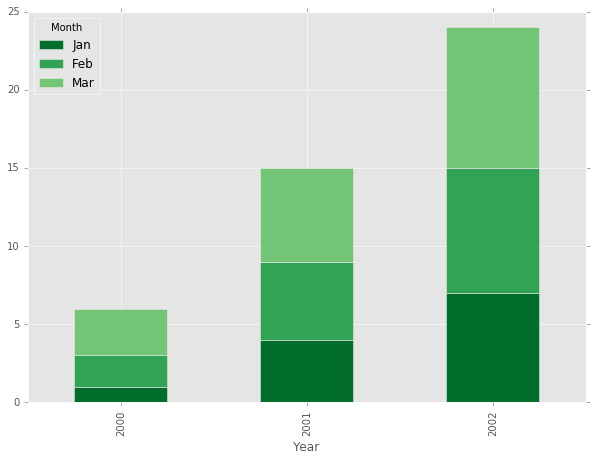
Iterative Solution
I have seen a few solutions that take a more iterative approach, creating a new layer in the stack for each category. This is accomplished by using the same axis object ax to append each band, and keeping track of the next bar location by cumulatively summing up the previous heights with a margin_bottom array.
fig, ax = plt.subplots(figsize=(10,7))

months = df['Month'].drop_duplicates()
margin_bottom = np.zeros(len(df['Year'].drop_duplicates()))
colors = ["#006D2C", "#31A354","#74C476"]

for num, month in enumerate(months):
    values = list(df[df['Month'] == month].loc[:, 'Value'])

    df[df['Month'] == month].plot.bar(x='Year',y='Value', ax=ax, stacked=True,
                                    bottom = margin_bottom, color=colors[num], label=month)
    margin_bottom += values

plt.show()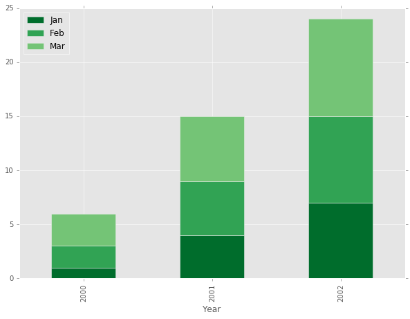
Using a Pivot
The above approach works pretty well, but there has to be a better way. After a little bit of digging, I found a better solution using the Pandas pivot function.
The pivot function takes arguments of index (what you want on the x-axis), columns (what you want as the layers in the stack), and values (the value to use as the height of each layer). Note that there needs to be a unique combination of your index and column values for each number in the values column in order for this to work.
The end result is a new dataframe with the data oriented so the default Pandas stacked plot works perfectly.
pivot_df = df.pivot(index='Year', columns='Month', values='Value')
pivot_df| Month | Feb | Jan | Mar |
|---|---|---|---|
| Year | |||
| 2000 | 2 | 1 | 3 |
| 2001 | 5 | 4 | 6 |
| 2002 | 8 | 7 | 9 |
#Note: .loc[:,['Jan','Feb', 'Mar']] is used here to rearrange the layer ordering
pivot_df.loc[:,['Jan','Feb', 'Mar']].plot.bar(stacked=True, color=colors, figsize=(10,7))