Ed Hawkins from the University of Reading created a pretty neat climate change visualization that went viral a few months ago. It was seen by millions of people, and was eventually feautured in the opening ceremony of the olympics. I think the visualization was so effective because it shows a clear, undeniable trend in a format that is pretty simple to interpret. The color palette is also pretty effective, with the orange and red communicating “danger” as the temperature seems to spiral out of control.
The original was created in MATLAB, and distributed as a GIF, with a new image overlaid for each year. I thought it would be interesting to re-create this visualization using d3.js, which is a JavaScript data visualization library. Using d3.js allows you to build a visualization that loads faster, and is more interactive and customizable than a GIF. Try it out by clicking the play button below:
The value for each month is calculated as the difference from the global mean for the period 1850 to 2016. This graphic makes it pretty clear that temperatures are universally and progressively increasing over that time period.
Here are a few notable features of the data they point out in their blog post on the subject:
- 1877-78: strong El Nino event warms global temperatures
- 1880s-1910: small cooling, partially due to volcanic eruptions
- 1910-1940s: warming, partially due to recovery from volcanic eruptions, small increase in solar output and natural variability
- 1950s-1970s: fairly flat temperatures as cooling sulphate aerosols mask the greenhouse gas warming
- 1980-now: strong warming, with temperatures pushed higher in 1998 and 2016 due to strong El Nino events
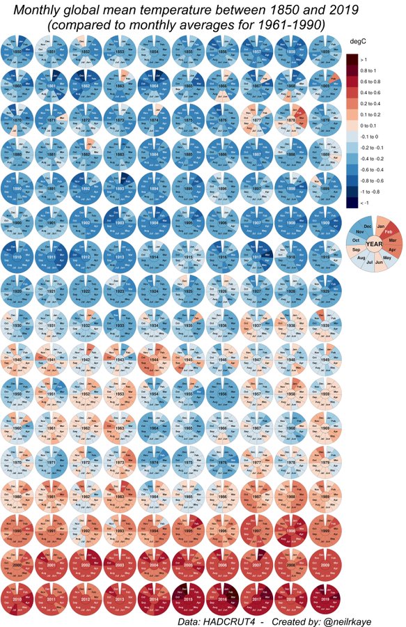
Update: If you’re more of a fan of static visualizations, take a look at this great one showing more recent data from Neil Kaye. I actually think this graphic is more informative than the dynamic one because you can see everything at once and compare across years. ¯\(ツ)/¯
The rest of this post walks through how I built the visualization, focusing on the tricky parts like plotting a radial path, adding the gradient, and animating the path using a tween function. I started with a Nadieh Bremer’s example code as a base, and went from there. A full page version of the visualization is available here, and the full code and data are available here.
Getting the Data
All the data for this graphic are available here. I import and parse the TSV from the Hadley Center directly and use various D3 functions to convert the numerical values and dates to pixel positions on the SVG.
Adding the Path
One confusing thing about building plots in d3 is that what many would consider a line is actually called a path. More specifically, a path is a series of lines connecting a set of points. So how do build a path?
First, you need to create functions that interpret the input data you have into pixel values. A polar plot requires a radian value to communicate the level of rotation around the center, and a second value to communicate the distance from the center. These two functions accomplish this task:
var distScale = d3.scale.linear()
    .range([innerRadius, outerRadius])
    .domain([domLow, domHigh]);

var radian = d3.scale.linear()
    .range([0, Math.PI*2*(climateData.length/12) ])
    .domain(d3.extent(climateData, function(d) { return d.date; }));
The distScale function takes values that range from the lowest to the highest input values, and converts them to radial distances that will fit between the inner and outer radius that is set elsewhere in the code.
The radian function does something similar, but instead of returning a pixel value, it returns a value between 0 and Math.PI*2*(climateData.length/12), with one year/one full rotation around the circle being equal to Math.PI*2 radians. So the radian function converts a date between 1850 and 2016 to a radian value, which is then used below in the line function.
Next, we’re ready to apply the two scaling functions from above to build the line function:
var line = d3.svg.line.radial()
    .angle(function(d) { return radian(d.date); })
    .radius(function(d) { return distScale(d.mean_temp); });
Rather than taking x and y functions, the radial line function takes the angle and radius functions that we created above.
Finally, we create the path using the line function, which is applied to every date and mean temperature in the dataset to produce the final path. Note that in the code, this is wrapped in an onClick function so it isn’t drawn immediately upon loading.
var path = barWrapper.append("path")
    .attr("d", line(climateData))
    .attr("class", "line")
    .attr("x", -0.75)
    .style("stroke", "url(#radial-gradient)")
Animating the Path
The work with the path isn’t quite done. If we don’t apply a transition to it, it will show up immediately. Below is the transition that I apply so it appears to circle the center until the full path is drawn. You can find a more in-depth explanation of how this transition works here.
var totalLength = path.node().getTotalLength();

path.attr("stroke-dasharray", totalLength + " " + totalLength)
    .attr("stroke-dashoffset", totalLength)
    .transition()
    //Works, but kind of a hack:
    .tween("customTween", function() {
        return function(t) {
            d3.select("text.yearText").text(years[Math.floor(t*years.length-1)])
                .transition()
                .duration(t/1.5);
        };
    })
    .duration(duration)
    .ease("linear")
    .attr("stroke-dashoffset", 0);
Note that I also apply a tween function to the transition. This oddly named function splits the transition up evenly into time increments between 0 and 1. The function is applied at each time increment, passing the new time value in for t. I use this function for it’s side effect, and change the year text in the center of the plot using it. This probably isn’t a best practice, but it works for me in this situation.
Adding the Gradient
The final step is to add the gradient to the line, so the color changes from blue to red as the temperature anomaly increases. Creating a gradient along a path can be kind of a pain. But we can take advantage of the fact that this is a polar plot and apply a radial gradient to the underlying SVG, and then have the line pick up that gradient.
Here’s the code that does that:
//Base the color scale on average temperature extremes
var colorScale = d3.scale.linear()
    .domain([domLow, (domLow+domHigh)/2, domHigh])
    .range(["#2c7bb6", "#ffff8c", "#d7191c"])
    .interpolate(d3.interpolateHcl);

//Calculate the variables for the temp gradient
var numStops = 10;
tempRange = distScale.domain();
tempRange[2] = tempRange[1] - tempRange[0];
tempPoint = [];
for(var i = 0; i < numStops; i++) {
    tempPoint.push(i * tempRange[2]/(numStops-1) + tempRange[0]);
}

//Create the radial gradient
var radialGradient = svg.append("defs")
    .append("radialGradient")
    .attr("id", "radial-gradient")
    .selectAll("stop")
    .data(d3.range(numStops))
    .enter().append("stop")
    .attr("offset", function(d,i) { return distScale(tempPoint[i])/ outerRadius; })
    .attr("stop-color", function(d,i) { return colorScale( tempPoint[i] ); });
The code essentially divides the distance between the inner radius and outer radius into ten evenly spaces stop points that are then applied to the radial gradient. The color comes from a color function, which is set to vary from blue to red across the radial values.
Then we just apply the url(#radial-gradient) style to the path when we create it:
//Create path using line function
var path = barWrapper.append("path")
    .attr("d", line(climateData))
    .attr("class", "line")
    .attr("x", -0.75)
    .style("stroke", "url(#radial-gradient)");
Conclusion
Hopefully this post is somewhat clear, and helps someone out if they’re trying to do something similar. I think this post highlights both the expressive power of D3, and that it can be confusing at times.
Oh, and also, we need to do something about carbon emissions!