One interesting feature of the electoral college is that some states have more electoral votes per person than others. This, combined with the fact that we have swing states, means the importance of a vote varies considerably by location.
Andrew Gelman has done some work on this subject by calculating the probability a voter will swing a presidential election. Below, I ask a different but related question: “Given an election turned out the way it did, how valuable was an additional vote in each state?” This alternate metric, called the Voting Power Index (VPI), is discussed more at the DailyKos here. Rather than rely on predicted probabilities of electoral outcomes, this metric simply divides the state’s electoral votes by the realized vote margin:
state_vpi = state_electoral_votes/(dem_voters - rep_voters)
I decided to take this metric a step further and calculate a county VPI, which is the fraction of the state’s voting power that resides with the voting age population of each county:
county_vpi = state_vpi*(county_vap/state_vap)
These numbers can then provide some insight on the ongoing persuasion vs. turnout debate because the county voting power can be further disaggregated by voting status:
persuasion_vpi = county_vpi*(voting_vap/county_vap)turnout_vpi = county_vpi*(nonvoting_vap/county_vap)
This turnout_vpi value could hopefully act as an adjustment on the numbers from The Missing Obama Millions article, which didn’t take the electoral college into account. To be honest, I’m mainly using this metric because it’s straightforward to calculate and easy to understand. I haven’t fully considered all the implications, but it seems to produce results that are similar to other analyses [5]. I’m definietly open to critique from others in order to “kick the tires” of this metric.
These data were compiled for a previous visualization, and are available along with all the code here.
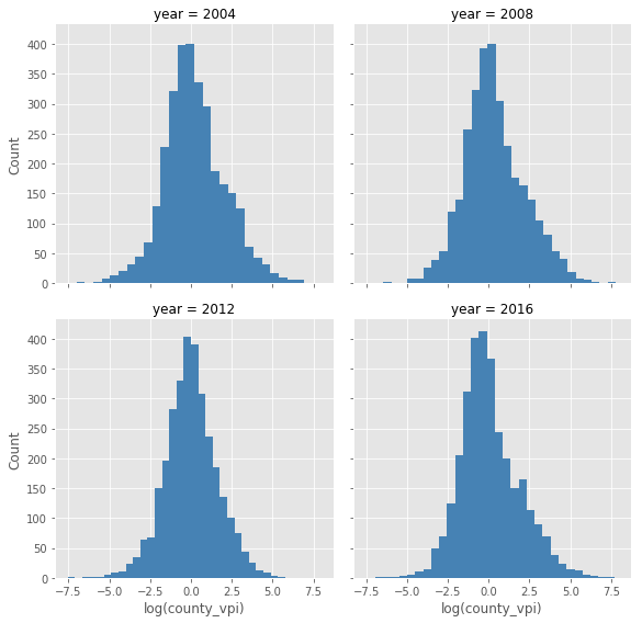
Visualizing the County Data
These plots show that the VPI follows a lognormal or power law distribution, with some years like 2012 having fewer outlying values. A power law distribution wouldn’t be too surprising because the values are derived from county population values, which follow something close to a power law themselves.
A Closer Look at 2016
Below, I select out just the 2016 values for a more in-depth look. One important point to make is that the VPI only shows counties that were important given the way the election turned out. It’s entirely possible that a different set of counties would show up if campaigns focused their resources elsewhere, depending on how powerful you think campaigns are. So this 2016 data is more useful for providing a picture of what happened, rather than saying what should have been done instead. The averages I look at later can provide more of a general picture of places that tend to be important.
Top 2016 Counties
The following table just shows the counties sorted by top VPI in 2016:
county2016_df = county_df[county_df['year'] == 2016]

cols_2016 = ['county_name','state', 'year', 'dem_margin',
             'turnout', 'turnout_vpi', 'persuasion_vpi', 'county_vpi',]

county2016_df[cols_2016].sort_values(by='county_vpi', ascending=False).head(30)| county_name | state | year | dem_margin | turnout | turnout_vpi | persuasion_vpi | county_vpi | |
|---|---|---|---|---|---|---|---|---|
| 4847 | Hillsborough County | NH | 2016 | -0.0020 | 0.6545 | 763.202291 | 1446.068221 | 2209.270512 |
| 4849 | Rockingham County | NH | 2016 | -0.0583 | 0.7383 | 435.852891 | 1229.390599 | 1665.243490 |
| 4390 | Wayne County | MI | 2016 | 0.3734 | 0.5837 | 539.384492 | 756.163891 | 1295.548383 |
| 4371 | Oakland County | MI | 2016 | 0.0811 | 0.6801 | 303.963423 | 646.094828 | 950.058250 |
| 4848 | Merrimack County | NH | 2016 | 0.0308 | 0.6848 | 259.213077 | 563.095587 | 822.308664 |
| 4826 | Clark County | NV | 2016 | 0.1096 | 0.4527 | 443.659050 | 366.924796 | 810.583846 |
| 4850 | Strafford County | NH | 2016 | 0.0856 | 0.6590 | 241.359028 | 466.455912 | 707.814940 |
| 4358 | Macomb County | MI | 2016 | -0.1153 | 0.6148 | 255.384842 | 407.628058 | 663.012901 |
| 4846 | Grafton County | NH | 2016 | 0.1896 | 0.6738 | 166.484551 | 343.872287 | 510.356838 |
| 4349 | Kent County | MI | 2016 | -0.0308 | 0.6372 | 170.557276 | 299.596590 | 470.153866 |
| 4844 | Cheshire County | NH | 2016 | 0.1262 | 0.6652 | 142.008996 | 282.158481 | 424.167478 |
| 3183 | Maricopa County | AZ | 2016 | -0.0289 | 0.4787 | 191.532380 | 175.913839 | 367.446219 |
| 6165 | Milwaukee County | WI | 2016 | 0.3701 | 0.6069 | 144.012269 | 222.310555 | 366.322824 |
| 4842 | Belknap County | NH | 2016 | -0.1678 | 0.7013 | 100.996831 | 237.125381 | 338.122212 |
| 4333 | Genesee County | MI | 2016 | 0.0946 | 0.6238 | 115.104725 | 190.826300 | 305.931025 |
| 4389 | Washtenaw County | MI | 2016 | 0.4128 | 0.6460 | 100.443951 | 183.323358 | 283.767309 |
| 5372 | Philadelphia County | PA | 2016 | 0.6698 | 0.5792 | 115.593496 | 159.124457 | 274.717953 |
| 4843 | Carroll County | NH | 2016 | -0.0566 | 0.7359 | 71.663218 | 199.688143 | 271.351361 |
| 4418 | Hennepin County | MN | 2016 | 0.3493 | 0.7074 | 74.660455 | 180.535170 | 255.195626 |
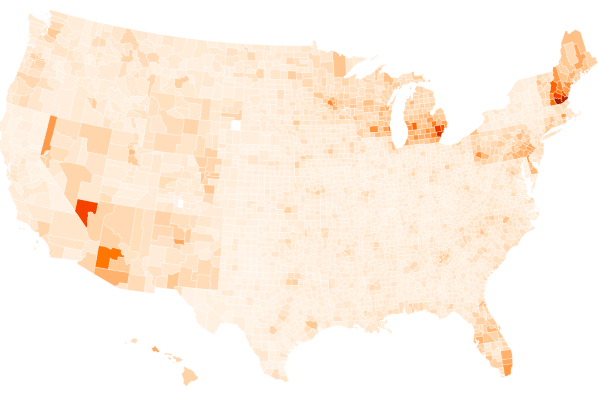
Here’s an interactive map showing VPI by county in 2016:
Which counties were crucial in states Democrats lost?
#Important counties for Democrats, in states they lost:
county2016_df[(county2016_df['state_dem_margin'] < 0)] \
.sort_values(by='county_vpi', ascending=False)[cols_2016].head(20)| county_name | state | year | dem_margin | turnout | turnout_vpi | persuasion_vpi | county_vpi | |
|---|---|---|---|---|---|---|---|---|
| 4390 | Wayne County | MI | 2016 | 0.3734 | 0.5837 | 539.384492 | 756.163891 | 1295.548383 |
| 4371 | Oakland County | MI | 2016 | 0.0811 | 0.6801 | 303.963423 | 646.094828 | 950.058250 |
| 4358 | Macomb County | MI | 2016 | -0.1153 | 0.6148 | 255.384842 | 407.628058 | 663.012901 |
| 4349 | Kent County | MI | 2016 | -0.0308 | 0.6372 | 170.557276 | 299.596590 | 470.153866 |
| 3183 | Maricopa County | AZ | 2016 | -0.0289 | 0.4787 | 191.532380 | 175.913839 | 367.446219 |
| 6165 | Milwaukee County | WI | 2016 | 0.3701 | 0.6069 | 144.012269 | 222.310555 | 366.322824 |
| 4333 | Genesee County | MI | 2016 | 0.0946 | 0.6238 | 115.104725 | 190.826300 | 305.931025 |
| 4389 | Washtenaw County | MI | 2016 | 0.4128 | 0.6460 | 100.443951 | 183.323358 | 283.767309 |
| 5372 | Philadelphia County | PA | 2016 | 0.6698 | 0.5792 | 115.593496 | 159.124457 | 274.717953 |
| 4341 | Ingham County | MI | 2016 | 0.2687 | 0.5697 | 96.279322 | 127.483898 | 223.763221 |
| 5323 | Allegheny County | PA | 2016 | 0.1645 | 0.6601 | 75.873263 | 147.367799 | 223.241062 |
| 6137 | Dane County | WI | 2016 | 0.4717 | 0.7387 | 55.366688 | 156.548600 | 211.915288 |
| 4378 | Ottawa County | MI | 2016 | -0.3047 | 0.6671 | 69.241319 | 138.756781 | 207.998100 |
| 4347 | Kalamazoo County | MI | 2016 | 0.1276 | 0.6177 | 75.981134 | 122.779735 | 198.760869 |
| 3441 | Miami-Dade County | FL | 2016 | 0.2960 | 0.4532 | 92.740626 | 76.856905 | 169.597531 |
Where was more turnout especially important for Democrats?
The partisanturnout_vpi multiplies the democratic margin for each county times the fraction of county’s voting power that resided with non-voters, in states that Democrats lost.
#Adjusting turnout for party margin
county_df['partisanturnout_vpi'] = county_df['dem_margin']*county_df['turnout_vpi']

county2016_df[(county2016_df['state_dem_margin'] < 0)] \
    .sort_values(by='partisanturnout_vpi', ascending=False) \
.head(20)| county_name | state | year | dem_margin | turnout | turnout_vpi | persuasion_vpi | county_vpi | partisanturnout_vpi | |
|---|---|---|---|---|---|---|---|---|---|
| 4390 | Wayne County | MI | 2016 | 0.3734 | 0.5837 | 539.384492 | 756.163891 | 1295.548383 | 201.406169 |
| 5372 | Philadelphia County | PA | 2016 | 0.6698 | 0.5792 | 115.593496 | 159.124457 | 274.717953 | 77.424524 |
| 6165 | Milwaukee County | WI | 2016 | 0.3701 | 0.6069 | 144.012269 | 222.310555 | 366.322824 | 53.298941 |
| 4389 | Washtenaw County | MI | 2016 | 0.4128 | 0.6460 | 100.443951 | 183.323358 | 283.767309 | 41.463263 |
| 3441 | Miami-Dade County | FL | 2016 | 0.2960 | 0.4532 | 92.740626 | 76.856905 | 169.597531 | 27.451225 |
| 6137 | Dane County | WI | 2016 | 0.4717 | 0.7387 | 55.366688 | 156.548600 | 211.915288 | 26.116467 |
| 4341 | Ingham County | MI | 2016 | 0.2687 | 0.5697 | 96.279322 | 127.483898 | 223.763221 | 25.870254 |
| 4371 | Oakland County | MI | 2016 | 0.0811 | 0.6801 | 303.963423 | 646.094828 | 950.058250 | 24.651434 |
| 3404 | Broward County | FL | 2016 | 0.3514 | 0.5507 | 53.225032 | 65.232522 | 118.457554 | 18.703276 |
| 5323 | Allegheny County | PA | 2016 | 0.1645 | 0.6601 | 75.873263 | 147.367799 | 223.241062 | 12.481152 |
| 4333 | Genesee County | MI | 2016 | 0.0946 | 0.6238 | 115.104725 | 190.826300 | 305.931025 | 10.888907 |
| 5367 | Montgomery County | PA | 2016 | 0.2128 | 0.6807 | 46.131019 | 98.363149 | 144.494168 | 9.816681 |
| 4347 | Kalamazoo County | MI | 2016 | 0.1276 | 0.6177 | 75.981134 | 122.779735 | 198.760869 | 9.695193 |
County Averages, 2004-2016
The above 2016 analysis is interesting but if we want values that are more generalizable to future elections it makes sense to look at averages. If you average over too few elections you risk overfitting to a specific point in time, but averaging over too many years will make the results irrelevant to the present. I was only able to compile data from 2004 forward anyways, so these are the years I went with.
| county_name | state | dem_margin | turnout | turnout_vpi | persuasion_vpi | county_vpi | |
|---|---|---|---|---|---|---|---|
| 1901 | Bernalillo County | NM | 0.149150 | 0.574300 | 322.191780 | 458.901725 | 781.093505 |
| 1875 | Hillsborough County | NH | 0.004500 | 0.673875 | 261.531237 | 509.284778 | 770.816015 |
| 1466 | St. Louis County County | MO | 0.147975 | 0.713775 | 146.267445 | 475.652972 | 621.920417 |
| 1877 | Rockingham County | NH | -0.033725 | 0.736700 | 154.517507 | 427.941955 | 582.459462 |
| 1935 | Clark County | NV | 0.123775 | 0.491850 | 274.776186 | 247.379861 | 522.156047 |
| 1418 | Jackson County | MO | 0.198300 | 0.625425 | 135.126185 | 287.882299 | 423.008484 |
| 1282 | Wayne County | MI | 0.432750 | 0.613300 | 148.977818 | 212.273072 | 361.250891 |
| 1876 | Merrimack County | NH | 0.086950 | 0.690625 | 91.522184 | 198.694873 | 290.217058 |
| 3004 | Milwaukee County | WI | 0.333100 | 0.681100 | 89.948122 | 193.970429 | 283.918551 |
| 1263 | Oakland County | MI | 0.077700 | 0.722425 | 82.209028 | 179.036279 | 261.245307 |
| 1878 | Strafford County | NH | 0.138775 | 0.653925 | 85.666172 | 161.759279 | 247.425451 |
| 1485 | St. Louis City County | MO | 0.648300 | 0.562800 | 87.590113 | 134.671075 | 222.261188 |
| 1908 | Dona Ana County | NM | 0.134450 | 0.487375 | 106.915843 | 111.046813 | 217.962656 |
| 1462 | St. Charles County | MO | -0.186850 | 0.691450 | 51.804907 | 160.086089 | 211.890996 |
| 149 | Maricopa County | AZ | -0.096975 | 0.504300 | 102.560581 | 101.472468 | 204.033050 |
| 1250 | Macomb County | MI | -0.001075 | 0.646625 | 69.591618 | 112.881508 | 182.473126 |
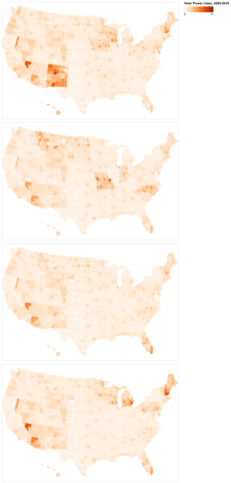
Here’s a map of the averages:
Which counties are important for Democrats, on average?
Next, I repeat much of the same analysis as for 2016 using these average values now. The following table shows counties that are crucial for Democrats in states they’re often within one standard deviation of losing:
#Using stdev as cutoff:
avg_df[(avg_df['state_dem_margin'] - avg_df['state_dem_margin_std'])  < 0] \
    .sort_values(by='county_vpi', ascending=False) \
[avg_cols].head(30)| county_name | state | dem_margin | turnout | turnout_vpi | persuasion_vpi | county_vpi | |
|---|---|---|---|---|---|---|---|
| 1875 | Hillsborough County | NH | 0.004500 | 0.673875 | 261.531237 | 509.284778 | 770.816015 |
| 1466 | St. Louis County County | MO | 0.147975 | 0.713775 | 146.267445 | 475.652972 | 621.920417 |
| 1877 | Rockingham County | NH | -0.033725 | 0.736700 | 154.517507 | 427.941955 | 582.459462 |
| 1935 | Clark County | NV | 0.123775 | 0.491850 | 274.776186 | 247.379861 | 522.156047 |
| 1418 | Jackson County | MO | 0.198300 | 0.625425 | 135.126185 | 287.882299 | 423.008484 |
| 1282 | Wayne County | MI | 0.432750 | 0.613300 | 148.977818 | 212.273072 | 361.250891 |
| 1876 | Merrimack County | NH | 0.086950 | 0.690625 | 91.522184 | 198.694873 | 290.217058 |
| 3004 | Milwaukee County | WI | 0.333100 | 0.681100 | 89.948122 | 193.970429 | 283.918551 |
| 1263 | Oakland County | MI | 0.077700 | 0.722425 | 82.209028 | 179.036279 | 261.245307 |
| 1878 | Strafford County | NH | 0.138775 | 0.653925 | 85.666172 | 161.759279 | 247.425451 |
| 1485 | St. Louis City County | MO | 0.648300 | 0.562800 | 87.590113 | 134.671075 | 222.261188 |
| 1462 | St. Charles County | MO | -0.186850 | 0.691450 | 51.804907 | 160.086089 | 211.890996 |
| 149 | Maricopa County | AZ | -0.096975 | 0.504300 | 102.560581 | 101.472468 | 204.033050 |
| 1250 | Macomb County | MI | -0.001075 | 0.646625 | 69.591618 | 112.881508 | 182.473126 |
| 1874 | Grafton County | NH | 0.207425 | 0.695250 | 56.945682 | 121.479588 | 178.425270 |
| 1409 | Greene County | MO | -0.230925 | 0.603550 | 58.499603 | 115.185390 | 173.684993 |
| 2976 | Dane County | WI | 0.426900 | 0.766800 | 37.693819 | 118.256630 | 155.950449 |
| 1683 | Mecklenburg County | NC | 0.199550 | 0.623500 | 46.769953 | 105.776832 | 152.546785 |
Where is turnout important for Democrats, on average?
These are counties that have a high partisanturnout_vpi, which is calculated by multiplying the Democratic margin in a county times the turnout_vpi, then filtering by states Democrats are within one standard deviation of losing on average.
#Using standard deviation as cutoff:
avg_df[(avg_df['state_dem_margin'] - avg_df['state_dem_margin_std'])  < 0] \
    .sort_values(by='partisanturnout_vpi', ascending=False) \
[temp_cols].head(20)| county_name | state | dem_margin | turnout | turnout_vpi | persuasion_vpi | county_vpi | partisanturnout_vpi | |
|---|---|---|---|---|---|---|---|---|
| 1485 | St. Louis City County | MO | 0.648300 | 0.562800 | 87.590113 | 134.671075 | 222.261188 | 59.512773 |
| 1282 | Wayne County | MI | 0.432750 | 0.613300 | 148.977818 | 212.273072 | 361.250891 | 56.343820 |
| 1418 | Jackson County | MO | 0.198300 | 0.625425 | 135.126185 | 287.882299 | 423.008484 | 33.846646 |
| 1466 | St. Louis County County | MO | 0.147975 | 0.713775 | 146.267445 | 475.652972 | 621.920417 | 28.579127 |
| 2264 | Philadelphia County | PA | 0.665325 | 0.609925 | 42.629915 | 61.745824 | 104.375739 | 28.265886 |
| 3004 | Milwaukee County | WI | 0.333100 | 0.681100 | 89.948122 | 193.970429 | 283.918551 | 26.973063 |
| 1935 | Clark County | NV | 0.123775 | 0.491850 | 274.776186 | 247.379861 | 522.156047 | 26.547873 |
| 333 | Miami-Dade County | FL | 0.189300 | 0.530975 | 70.069633 | 62.784885 | 132.854518 | 16.912560 |
| 2976 | Dane County | WI | 0.426900 | 0.766800 | 37.693819 | 118.256630 | 155.950449 | 14.620923 |
| 296 | Broward County | FL | 0.335900 | 0.597550 | 41.629796 | 54.008480 | 95.638276 | 14.402219 |
| 814 | Marion County | IN | 0.188175 | 0.543075 | 46.917241 | 71.846952 | 118.764192 | 12.542131 |
| 1683 | Mecklenburg County | NC | 0.199550 | 0.623500 | 46.769953 | 105.776832 | 152.546785 | 11.133419 |
How well does the VPI predict the future?
One purpose of this analysis is to use the VPI to predict the locations that will be important for future elections, so below I run a few regressions to estimate the predictive power. Note that I use the state level VPI for these regressions because the county level observations aren’t independent (they’re all derived from the state level VPI). First is a regression showing how the previous election predicts the next one:

So, looking at the R^2 values, the ability of the previous election to predict the next one varies but overall seems pretty unstable. Next, I look at how the average of the last three elections predicts the 2016 election:
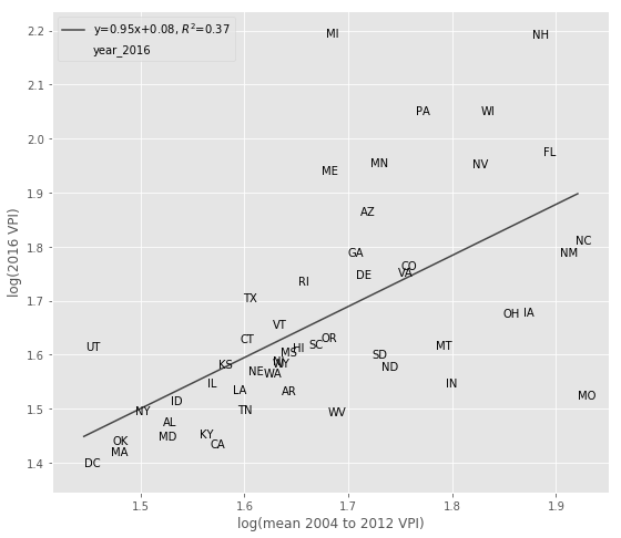
This seems like it might do a little better job, but it’s still pretty inconsistent at the high end of VPIs which is where you’d want to use it to allocate resources. So overall the VPI seems like it might be more useful as a metric to describe the results of past elections rather than predict the future.
Turnout vs. Persuasion
Next, I sum the persuasion and turnout values for each election, and then calculate their ratio. This shows that persuasion wins out in every election, but that these ratios can vary considerably. The average pesuasion to turnout ratio is 1.6:1, but the ratio was only 1.3:1 in 2012, a year with low turnout and few close states.
yr_df = county_df.groupby(['year']) \
    .agg({'persuasion_vpi': 'sum',
          'turnout_vpi': 'sum', 'turnout_advantage':'sum'})
yr_df['ratio'] = yr_df['persuasion_vpi'] / yr_df['turnout_vpi']
yr_df| turnout_advantage | turnout_vpi | persuasion_vpi | ratio | |
|---|---|---|---|---|
| 2004 | -7565.454805 | 11808.359012 | 19373.813817 | 1.640686 |
| 2008 | -10075.903226 | 11373.802537 | 21449.705764 | 1.885887 |
| 2012 | -1775.685570 | 5122.170093 | 6897.855664 | 1.346667 |
| 2016 | -7459.669223 | 11810.178369 | 19269.847592 | 1.631631 |
Averages for all elections:
yr_df.mean()

turnout_advantage    -6719.178206
turnout_vpi          10028.627503
persuasion_vpi       16747.805709
ratio                    1.626218
An interesting point Nate Cohn made is that when you persuade someone, it’s usually the case that you’re switching their vote from an opponent. On the face of it, this would make persuasion doubly effective:

But when you turn out a strong Democratic voter they’re likely to vote for every Democrat on the ballot, while persuading a Republican to vote for a particular candidate might only lead to a split ticket. So the net political effect of increased turnout might be larger when you consider every candidate on the ballot and their political power. In addition, if voting is habit forming, the benefits of increased turnout could extend to future elections [7].
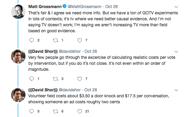
These results are interesting, but aren’t informative until we have data on the cost effectiveness of each approach, which probably depends on things like the population density and price of ad buys in different locations. Rather than thinking in binary terms, I think it makes sense to ask which strategy is better depending on the location. For more on this discussion, see this twitter thread:
Conclusion
- Voting power is lognormally or power law distributed, so some counties/voters are much more powerful than others.
- Certain locations in NH, NM, MO, NV, MI, WI, PA, and FL regularly top the list.
- At least according to this metric, persuasion has more power than turnout (an average 1.6:1 ratio), but the cost of each approach needs to be considered before drawing any conclusions.
- The VPI doesn’t do a very good job of predicting future elections, so it’s probably more useful as a way to describe results from the past.
Next steps
This analysis only considers the power of a location in the presidential elections, but Senate, House and State Level elections are crucial too. It wouldn’t be very hard to include results from Senate elections as those are statewide, but House districts don’t match county lines and have ever-changing boundaries. As a result, it would be hard to get Voting Age Population data and distribute the voting power amongst the counties.
One thing I could do is create a synthetic population of the US using census data. I could then distribute voting power to every individual based on their location in Presidential, Congressional and State elections, then aggregate it by any boundary I choose. I’d need accurate district boundaries, results for every election, and a model of how power is shared across branches of government to make this work though.
References
[1] What is the chance that your vote will decide the election? Ask Stan! http://andrewgelman.com/2016/11/07/chance-vote-will-decide-election/
[2] What is the Chance That Your Vote Will Decide the Election? https://pkremp.github.io/pr_decisive_vote.html
[3] Nate Cohn. https://twitter.com/Nate_Cohn/status/972608738631868416
[4] The Missing Obama Millions. https://www.nytimes.com/2018/03/10/opinion/sunday/obama-trump-voters-democrats.html
[5] Voter Power Index: Just How Much Does the Electoral College Distort the Value of Your Vote? https://www.dailykos.com/stories/2016/12/19/1612252/-Voter-Power-Index-Just-How-Much-Does-the-Electoral-College-Distort-the-Value-of-Your-Vote
[6] Synthpop: Synthetic populations from census data. https://github.com/UDST/synthpop
[7] Is Voting Habit Forming? New Evidence from Experiments and Regression Discontinuities. https://onlinelibrary.wiley.com/doi/abs/10.1111/ajps.12210