I recently read an interesting paper that looked at the relationship between social services spending and health outcomes across the OECD countries [1]. The authors of this paper ran a few regressions using healthcare and social services spending as a percentage of GDP as the predictors of population health outcomes. Here’s a summary of what they found:
In model 1, we found that health-service expenditures as a percentage of GDP were significantly associated with better health outcomes in only two of the five indicators (life expectancy and maternal mortality). In model 2, social expenditures as a percentage of GDP were significantly associated with better health outcomes in three of the five indicators (life expectancy, infant mortality and potential years of life lost) and with worse health outcomes in one of the indicators (low birth weight).
These findings fit with other research on the social determinants of health that suggests access to the healthcare system might only account for a small portion of overall health – other things like income, education levels, and quality of public institutions might make larger contributions (although this is controversial) [2,3]. So if we can target some of those determinants through social services spending, it has the potential to be a very cost effective approach to improving health.
The authors in the above study used Potential Years of Life Lost (PYLL) as one of the main measures of population health. This metric doesn’t include years lived with a disability (YLD), so I was interested in seeing how a more comprehensive measure of population health like the Disability Adjusted Life Year (YLLs + YLDs) affects this analysis. The Global Burden of Disease regularly conducts a study of global DALY burdens, so I dowloaded their 1990-2015 results. I also used per capita health and social services spending rather than spending as a percentage of GDP because I think the per capita figures are closer to what you want to measure.
The rest of this post looks at some of the relationships I found in the data. All the code is available in an IPython notebook here, and the input data is available in a zipped file here.
Getting the Data
I downloaded the 2015 Global Burden of Disease data from IHME’s website here. The units are DALYs per 100,000 population, and it’s age standardized across the countries. I also downloaded the OECD Social Services spending and GDP data from their website, with units of constant 2010 US dollars per capita, at purchasing power parity.
A First Look
With all the datasets loaded and combined, it’s time to take a look at some graphics. The first below just shows the DALY burden for each country in 2010, along with a 95% uncertainty interval for each country. Japan and many western European countries seem to be the healthiest, with the US near the bottom in terms of DALY burden.
oecdgbd2010_df = oecdgbd_df[oecdgbd_df['year'] == 2010].sort_values(by='dalyrate',ascending=True)

oecdgbd2010_df.reset_index(drop=True, inplace=True)

#print set(oecd_countries) - set(oecdgbd2010_df['location'])
#Missing countries, no data for this year:
#set(['Slovenia', 'South Korea', 'Slovakia', 'Czech Republic', 'Estonia'])

fig = plt.figure() # Create matplotlib figure
ax = fig.add_subplot(111) # Create matplotlib axes
width = 0.5

oecdgbd2010_df.plot.bar(x='location', y='dalyrate', ax=ax,
                width=width, color=('green'),figsize=(11,8), alpha=0.7)

#Remember, this is a 95% uncertainty interval
plt.errorbar(oecdgbd2010_df.index.values,
             oecdgbd2010_df['dalyrate'].values,
             yerr= oecdgbd2010_df[['yerr_lower','yerr_upper']].T.values,
             color='black', linestyle='none', elinewidth=1.25)

ax.set_ylabel('DALYs per 100,000, Age Standardised')

plt.show()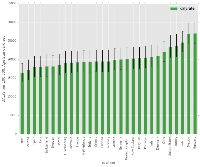
Trends Over Time
There is a pretty clear downward trend for most countries over this time period, although the slopes of countries like Turkey are much steeper.
fig, ax = plt.subplots(figsize=(10,8))

countries = oecdgbd_df['location'].drop_duplicates()

for num, country in enumerate(countries):
    x_vals = oecdgbd_df[(oecdgbd_df['location'] == country)].loc[:,'year']
    y_vals = oecdgbd_df[(oecdgbd_df['location'] == country)].loc[:,'dalyrate']
    #plt.scatter(x=x_vals, y=y_vals, color=colors[num], s=20, alpha=1.0, marker='o', linewidths=1) #, label=str(country)
    #plot([1,2,3], [1,2,3], 'go-', label='line 1', linewidth=2)
    if num % 4 == 0:
        plt.plot(x_vals, y_vals,'-o', linewidth=2, label=str(country))
    else:
        plt.plot(x_vals, y_vals,'-o', linewidth=2, label='_nolegend_')

plt.xlabel('Year')
plt.ylabel('DALY per 100,000, Age Standardized')
plt.legend()
plt.show()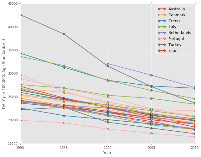
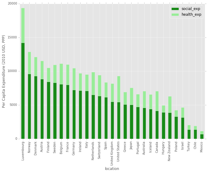
Health and Social Expenditure by Country
This next chart is a barplot, showing the social and health expenditure by country. It’s ordered by the total social expenditure, descending. The US social services spending in on par with other countries, but the total health spending sticks out above most others.
#Take a look at stacked bar of healthcare, ordered by total expenditure

fig = plt.figure() # Create matplotlib figure
ax = fig.add_subplot(111) # Create matplotlib axes
width = 0.5

#Sort by social_expenditure
oecdgbd2010_df.sort_values(by='social_exp',ascending=False)[['location','social_exp', 'health_exp']].plot.bar(
    x='location', stacked=True, ax=ax, width=width, color=('green', 'lightgreen'),figsize=(11,8),alpha=0.9)

ax.set_ylabel('Per Capita Expenditure (2010 USD, PPP)')

plt.show()
A Different Perspective
Next, here is another way to look at the above bar chart. This time, countries are ordered by their DALY burden on the x-axis, and the y-axis shows social and health expenditure. It’s pretty striking how badly the United States is doing in health outcomes given the amount that it spends on health and social services. Also, it’s interesting to note that Japan, Iceland, Israel, and a number of other countries spend less combined than the US with much better outcomes, so spending alone doesn’t result in good health outcomes.
Are these differences due to our genetics/cultural norms/other social determinants in the US, or are we just really inefficient in the way we spend our money?
fig, ax = plt.subplots(figsize=(11,8))

#http://matplotlib.org/1.3.0/api/axes_api.html#matplotlib.axes.Axes.vlines
#http://matplotlib.org/1.3.0/api/collections_api.html#matplotlib.collections.LineCollection
#Difference is the healt_exp, mimics stacked effect
ax.vlines(x = oecdgbd2010_df['dalyrate'], ymin=0, ymax = oecdgbd2010_df['total_exp'],
          colors='lightgreen', linewidths=6, alpha=0.9, label='Health Expenditure')
ax.vlines(x = oecdgbd2010_df['dalyrate'], ymin=0,  ymax = oecdgbd2010_df['social_exp'],
          colors='green', linewidths=6, alpha=0.7, label='Social Expenditure')

ax.set_xlabel('DALY per 100,000, Age Standardized')
ax.set_ylabel('Per Capita Expenditure, Social and Health (2010 USD, PPP)')


A = oecdgbd2010_df['dalyrate']
B = oecdgbd2010_df['total_exp']
C = oecdgbd2010_df['location']
D = range(len(C))

#print A, B, C, D

for a,b,c,d in zip(A, B, C, D):
    if d % 1 == 0: #Annotate every n
        ax.annotate('%s' % c, xy=(a,b), textcoords='data', rotation=90) #xy=(a,b+30)

legend = ax.legend(loc=1, shadow=False)

plt.show()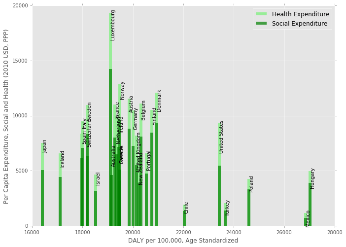
Finally, here is a scatterplot of health versus social services expenditure. Aside from Luxembourg, the US has the highest health spending, but has much lower social services spending than most Western European countries.
fig, ax = plt.subplots(figsize=(10,8))  #figsize=(12,10)

plt.scatter(x=oecdgbd2010_df['health_exp'], y=oecdgbd2010_df['social_exp'],
            marker='o', alpha=0.9, label='_nolegend_')

ax.set_xlim(0,6000)
ax.set_ylim(0, 16000)
#s=20

# points linearlyd space on lstats
x = pd.DataFrame({'line': np.linspace(0, 16000, 100)})

plt.plot(x, x, 'b--', alpha=0.9, label='Equal')

A = oecdgbd2010_df['health_exp']
B = oecdgbd2010_df['social_exp']
C = oecdgbd2010_df['location']
D = range(len(C))

for a,b,c,d in zip(A, B, C, D):
    if d % 1 == 0: #Annotate every n
        ax.annotate('%s' % c, xy=(a,b), textcoords='data')

plt.xlabel('Per Capita Health Expenditure (2010 USD, PPP)')
plt.ylabel('Per Capita Social Expenditure (2010 USD, PPP)')

plt.legend()

plt.show()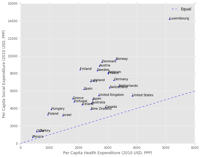
How are these variables related?
Pandas has a cool plotting function called a scatter matrix, where it will show you scatter plots of each variable against the others in your dataframe. In addition, it shows the Kernel Density Estimate (KDE) on the diagonal, which is an estimate of the Probability Density Function of each variable. This gives you a quick view of all the data, and potential distribution issues to look out for in the regression.
It looks like both the dalyrate and gdp_capita variables have positive skews based on their KDE, so it might make sense to normalize these variables using a log or some other correction.
#Import scatter matrix function:
from pandas.tools.plotting import scatter_matrix

# Copy dataframe
model_df = oecdgbd_df.copy()

#Not sure 0 expenditure is a reliable number.
#Remove Slovenia, with value of 0 social_exp for 1995, and Chile, with 0 health_exp in 1990
model_df = model_df[(model_df['social_exp'] != 0 ) & (model_df['health_exp'] != 0 )]


scatter_matrix(model_df[['dalyrate', 'gdp_cap', 'social_exp', 'health_exp']],
               alpha=1.0, figsize=(10, 8), diagonal='kde')  #diagonal='kde' or 'hist'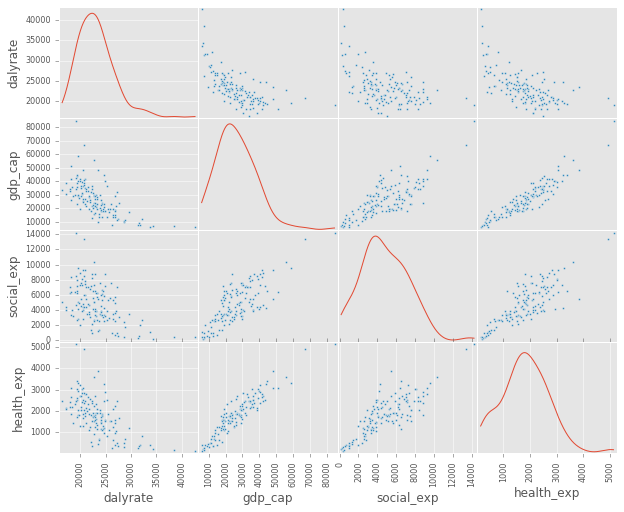
A Closer Look at Social Services and DALYs
Below is scatter of the social services expenditure against the DALY burden. There seems to be a clear log-linear relationship between the two, which makes sense given the Preston curve. I also color coded each year to show the general shift down and to the right over time (better health, and more social services spending).
fig, ax = plt.subplots(figsize=(10,8))  #figsize=(12,10)

# Points linearlyd space on lstats
x = pd.DataFrame({'social_exp': np.linspace(model_df['social_exp'].min(),
                                            model_df['social_exp'].max(), 100)})

# 1st order polynomial
# Note: mse_resid is the sum of squared residuals divided by the residual degrees of freedom.
poly_1 = smf.ols(formula='dalyrate ~ 1 + social_exp', data=model_df, missing='drop').fit()

plt.plot(x, poly_1.predict(x), 'b-', label='Poly n=1 $R^2$=%.2f  RSE=%.2f' %
         (poly_1.rsquared, np.sqrt(poly_1.mse_resid)), alpha=0.9)

#np.log is natural log:
#Log makes sense, given the Preston Curve: https://en.wikipedia.org/wiki/Preston_curve
log_1 = smf.ols(formula='dalyrate ~ 1 + np.log(social_exp)',
                data=model_df, missing='drop').fit()

plt.plot(x, log_1.predict(x), 'y-', alpha=0.9, label='Log $R^2$=%.2f  RSE=%.2f' %
         (log_1.rsquared, np.sqrt(log_1.mse_resid)) )

colors = ['#FB6A4A', '#6BAED6', '#9E9AC8', '#74C476', '#696969']

years = [1990, 1995, 2000, 2005, 2010]

for num, year in enumerate(years):
    x_vals = model_df[(model_df['year'] == year)].loc[:,'social_exp']
    y_vals = model_df[(model_df['year'] == year)].loc[:,'dalyrate']
    plt.scatter(x=x_vals, y=y_vals, color=colors[num], s=20, alpha=1.0, marker='o', label=str(year))

plt.xlabel('Per Capita Social Expenditure (2010 USD, PPP)')
plt.ylabel('DALY per 100,000, Age Standardized')


plt.legend()
plt.show()

#print poly_1.summary()
#print log_1.summary()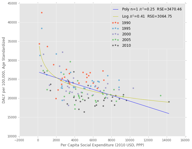
A Linear Mixed Effects Model
It doesn’t make sense to fit a Linear Regression to the entire dataset because the observations of each country over multiple years are not independent. The data are considered panel data, so either using General Estimating Equations or a Linear Mixed Effects Model is necessary to deal with interdependent measures. A good overview of the differences between the two is available here.
The authors of the original paper [1] decided to use a Mixed Linear Model, so that is what I’ll use as well. Here is the description of their methods:
We used standard descriptive analyses to characterise the percentage of GDP in each country that was spent on health services, social services and the ratio of social expenditures to health expenditures, using 2005 data. In addition, we estimated a series of mixed-effects models with the pooled data over 11 years and 29 countries to examine the correlation of health service expenditures and the five outcomes, of social services expenditures and the five outcomes, and of the ratio of social to health service expenditures, adjusted for health expenditures, and the five outcomes. We also examined the interaction of social expenditures and health expenditures. In each model, we included the logarithm of GDP per capita measured in US dollars adjusted for purchasing power parity, and we allowed the intercept and the expenditure variables to vary randomly over countries. To account for heteroskedasticity, we estimated the residual errors inde- pendently for each country.
I don’t have all the data from their study, and don’t know enough about statistics to reproduce it in it’s entirety, but I’ll at least run the linear mixed effects regression of the DALY rate on per capita health, social services and GDP variables using Python Statsmodels.
Below, I take the natural log of the dalyrate variable to prevent heteroscedacity, and also take the natural log of the rest of the variables to make it easier to interpret the coefficients. I allow intercepts to vary randomly across the countries, and allow the slopes to vary randomly for the social and health expenditure variables. For more on how this model works, see the explanation in Appendix A.
mixed_1 = smf.mixedlm(formula='np.log(dalyrate) ~ 1 + np.log(social_exp) + np.log(health_exp) + np.log(gdp_cap)',
                      data=model_df, missing='drop', groups='location',
                      re_formula='~ 1 + np.log(social_exp) + np.log(health_exp)').fit()

print mixed_1.summary()
Mixed Linear Model Regression Results
========================================================================================
Model: MixedLM Dependent Variable: np.log(dalyrate)
No. Observations: 141 Method: REML
No. Groups: 29 Scale: 0.0004
Min. group size: 3 Likelihood: 232.0710
Max. group size: 5 Converged: Yes
Mean group size: 4.9
----------------------------------------------------------------------------------------
Coef. Std.Err. z P>|z| [0.025 0.975]
----------------------------------------------------------------------------------------
Intercept 13.408 0.162 82.686 0.000 13.090 13.726
np.log(social_exp) -0.080 0.029 -2.735 0.006 -0.137 -0.023
np.log(health_exp) -0.046 0.034 -1.351 0.177 -0.112 0.021
np.log(gdp_cap) -0.234 0.026 -9.005 0.000 -0.285 -0.183
Intercept RE 0.454 11.343
Intercept RE x np.log(social_exp) RE -0.011 1.163
np.log(social_exp) RE 0.005 0.218
Intercept RE x np.log(health_exp) RE -0.047 1.438
np.log(social_exp) RE x np.log(health_exp) RE -0.004 0.205
np.log(health_exp) RE 0.012 0.329
========================================================================================
/Users/psthomas/miniconda2/envs/datascience/lib/python2.7/site-packages/statsmodels/regression/mixed_linear_model.py:1717: ConvergenceWarning: The MLE may be on the boundary of the parameter space.
warnings.warn(msg, ConvergenceWarning)
(Note that the above ConvergenceWarning is probably due to the fact that some of the coefficients are very small)
Results
Overall, social expenditure and GDP per capita have significant and negative associations with the DALY burden at the 5% level. Becuase I took the natural log of both the independent and dependent variables, the coefficients can be interpreted as the percent change in DALY burden for each 1% change in the independent variable. So, in this case, a 1% increase in GDP per capita is associated with a -0.234% decline in DALY burden. The effect size for social expenditure is about a third that of GDP, at a -0.08% decline.
Note that these relationships aren’t neccessarily causative. Whether GDP growth causes better health outcomes is actually still a pretty controversial question according to my analysis. It’s possible that better health causes GDP growth, or there is a third factor like good institutions that causes both.
I’m not very confident in the results of this regression for a few reasons:
- This is the first time I’ve done a regression analysis, and most of my background is from a chapter I read on the subject a week ago.
- The results seem kind of fragile, and different data transforms and interaction effects can change the results pretty easily.
- I’m not sure if I should include the year as a predictor as well.
- I don’t know how to check for heteroscedacity in the residuals, as statsmodels doesn’t have a simple method for doing so with a mixed linear model.
- There also aren’t any easy tests for collinearity with the mixed linear model, so I’m not sure how to test for that issue.
Regardless of the above problems, the relationship between GDP and health outcomes is pretty constant between models, so I am fairly confident that association is significant. This fits with the narrative that there are some social determinants like GDP growth that are very important for health, and that social or health services expenditures might not be sufficient replacements for the effects of growth.
When it comes to the policy implications, though, everyone seems to want to increase long term economic growth. But slow growth in the West seems to be a very tough problem to crack. So, in practice, increasing social services spending in a cost effective way might be the most actionable policy advice for improving health.
Cost Effectiveness
One nice side effect of the units that I used is that without the log transforms, the slope between variables has units of cost effectiveness (DALY/$). See Appendix B for a version of the regression without the natural log.
Conclusion
Although I’m not certain about the results of the regression, I still think it’s possible to come to some general conclusions about the data.
-
Most OECD countries are seeing a decline in DALY burdens over time, although the rate of the decline varies by country.
-
The US has very poor health outcomes for the amount of money we spend on both health and social services. This could be due to a combination of differences in culture, genetic predisposition, the cost effectiveness of our spending, or some other social determinant.
-
Many Western European countries with better health outcomes spend less on health expenditures, but more on social services than the US. Most of these countries also have universal healthcare systems where the government has the clout to negotiate prices with hospitals [4].
-
Some OECD countries, especially Japan and Israel, spend much less on both health and social services than the US with much better outcomes. This suggests there’s at least some room to increase the efficiency of spending. Given the likely political climate over the next few years, increases in efficiency will probably be the only way to improve health outcomes across the US through public policy. Paper [5] has an interesting take on the efficiency of social services spending, although I don’t fully agree with it.
Appendix A: How does the Mixed Linear Model work?
Just to give an idea of what the Mixed Linear Model is doing, I included the plot below. The plot shows linear curve fits for each country, allowing both the intercepts and the slopes to vary by country. Each of the individual country fits are then combined to give the coefficients and intercept of the overall model that is shown in regression results.
In reality, the below plot isn’t exactly right because we actually have to fit a plane between all the variables that minimizes the distance between the points and that plane, but this is just to give an idea of what’s going on.
colors = [
    "#000000", "#FFFF00", "#1CE6FF", "#FF34FF", "#FF4A46", "#008941", "#006FA6", "#A30059",
    "#FFDBE5", "#7A4900", "#0000A6", "#63FFAC", "#B79762", "#004D43", "#8FB0FF", "#997D87",
    "#5A0007", "#809693", "#FEFFE6", "#1B4400", "#4FC601", "#3B5DFF", "#4A3B53", "#FF2F80",
    "#61615A", "#BA0900", "#6B7900", "#00C2A0", "#FFAA92", "#FF90C9", "#B903AA", "#D16100",
    "#DDEFFF", "#000035", "#7B4F4B", "#A1C299", "#300018", "#0AA6D8", "#013349", "#00846F",
    "#372101", "#FFB500", "#C2FFED", "#A079BF", "#CC0744", "#C0B9B2", "#C2FF99", "#001E09",
    "#00489C", "#6F0062", "#0CBD66", "#EEC3FF", "#456D75", "#B77B68", "#7A87A1", "#788D66",
    "#885578", "#FAD09F", "#FF8A9A", "#D157A0", "#BEC459", "#456648", "#0086ED", "#886F4C"
]


fig, ax = plt.subplots(figsize=(10,8))

countries = model_df['location'].drop_duplicates()

#Cycle through and plot polynmoial for each country, demonstrating random intercept and slopes
for num, country in enumerate(countries):
    sub_df = model_df[(model_df['location'] == country)]
    x_vals = model_df[(model_df['location'] == country)].loc[:,'social_exp']
    y_vals = model_df[(model_df['location'] == country)].loc[:,'dalyrate']

    x = pd.DataFrame({'social_exp': np.linspace(sub_df['social_exp'].min() - 200,
                                            sub_df['social_exp'].max() + 200, 100)})

    poly = smf.ols(formula='dalyrate ~ 1 + social_exp', data=sub_df, missing='drop').fit()
    plt.plot(x, poly.predict(x), label='_nolegend_', alpha=0.9, color=colors[num])
    plt.plot(x_vals, y_vals,'o', linewidth=2, color=colors[num])

ax.set_xlim(0)

plt.xlabel('Per Capita Social Expenditure (2010 USD, PPP)')
plt.ylabel('DALY per 100,000, Age Standardized')

#plt.legend()
plt.show()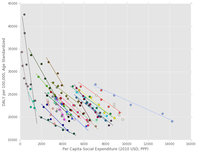
Appendix B: Alternate Regression
This version of the regression doesn’t take the natural log of any of the variables. Only GDP per capita is significant, with neither social or health expenditures significant at the 5% level. In this case, the coefficient units are DALY/100,000 USD, which are pretty similar to a common cost effectiveness measure in the field of healthcare economics.
The US government does not specifically put a monetary value on a year of life but, informally, the limit is probably in the 50,000-100,000 USD range [6,7]. So, if this regression is correct and the relationship is causative, increasing GDP isn’t a very cost effective health intervention (100,000 USD/0.195 DALY = 512,820 USD /DALY). I’ll have to think a little more about what this unit actually means, though, because I don’t think it has the same meaning as one in a public health context where a budget is being allocated based on cost effectiveness (the increase in GDP isn’t really being “spent” on direct care). In addition, there are probably declining marginal health returns from GDP increases, so maybe the log regression I do above provides a better picture of the relationship after all.
mixed_1 = smf.mixedlm(formula='dalyrate ~ 1 + social_exp + health_exp + gdp_cap',
                      data=model_df, missing='drop', groups='location',
                      re_formula='~ 1 + social_exp + health_exp').fit()

print mixed_1.summary()
Mixed Linear Model Regression Results
=====================================================================================
Model: MixedLM Dependent Variable: dalyrate
No. Observations: 141 Method: REML
No. Groups: 29 Scale: 380954.6895
Min. group size: 3 Likelihood: -1234.2353
Max. group size: 5 Converged: Yes
Mean group size: 4.9
-------------------------------------------------------------------------------------
Coef. Std.Err. z P>|z| [0.025 0.975]
-------------------------------------------------------------------------------------
Intercept 32160.582 951.867 33.787 0.000 30294.957 34026.206
social_exp -0.019 1.132 -0.017 0.986 -2.238 2.199
health_exp -3.462 2.791 -1.241 0.215 -8.933 2.008
gdp_cap -0.195 0.037 -5.279 0.000 -0.267 -0.122
Intercept RE 20195029.905 20371.670
Intercept RE x social_exp RE 2339.760 16.861
social_exp RE 3.803 0.019
Intercept RE x health_exp RE -28424.413 56.030
social_exp RE x health_exp RE -18.391 0.080
health_exp RE 106.683 0.279
=====================================================================================
References
[1] Health and social services expenditures: associations with health outcomes. https://www.ncbi.nlm.nih.gov/pubmed/21447501
[2] Different Perspectives for Assigining Weights to Determinants of Health.
https://uwphi.pophealth.wisc.edu/publications/other/different-perspectives-for-assigning-weights-to-determinants-of-health.pdf
[3] The Relative Contribution of Multiple Determinants to Health Outcomes. http://healthaffairs.org/healthpolicybriefs/brief_pdfs/healthpolicybrief_123.pdf
[4] Bitter Pill: Why Medical Bills Are Killing Us. http://www.uta.edu/faculty/story/2311/Misc/2013,2,26,MedicalCostsDemandAndGreed.pdf
[5] The True Levels of Government and Social Expenditures in Advanced Economies. https://piie.com/publications/pb/pb15-4.pdf
[6] Systematic review of the literature on the cost-effectiveness threshold. https://www.ncbi.nlm.nih.gov/books/NBK274312/
[7] Updating Cost-Effectiveness — The Curious Resilience of the $50,000-per-QALY Threshold. http://www.nejm.org/doi/full/10.1056/NEJMp1405158?af=R&rss=currentIssue&#t=article