At first I thought this would be fairly simple question to answer. Just sum up the new cases over the past few weeks and divide by the total population of each region, right? I took a similar approach in my previous post, but this probability is actually much more difficult to estimate for a few reasons outlined in this paper:
- There’s a 10 day lag between an infection and a reported case and a 20 day lag between an infection and death on average. This means the counts we see today reflect the past. The effect of this lag on the numbers depends on the growth rate of the pandemic at the time.
- Roughly 35-40% of cases are asymptomatic. These cases will never show up in the numbers unless we do random testing.
- Even among symptomatic people, a large fraction (right now estimated at 65% for the US) will never have a positive test. Perhaps they don’t seek one out, one isn’t available, or they have a false negative result.
- The availability of testing influences many of the numbers above.
The end result is that it’s probably more accurate to estimate the true number of infections using a SEIR model that matches the reported deaths, rather than back-calculating infections from reported cases. This is what the model I ended up choosing does; see the appendix below for more information.
So after that lengthy introduction, here’s the probability that a person is infected by state in the US. Note: As of October 5th this model will no longer be updated, so I’m looking for a replacement currently. If you want a simple probability estimate by region, see my previous post on the subject.
This model also has results for some counties that contain major urban areas, so here’s the probability of infection by US county:
The model also has estimates for a number of countries, but I haven’t found those results to be as reliable as the US focused models, so I’m leaving them out for now.
Note that although the peak for New York state above is a little over 9%, the peak for the five boroughs of New York City is over 15%. This means that if you attended a meeting with 10 random people at the peak of the outbreak, there was a 80% chance someone attending was infected (1-(1-p)^n= 1-(1-0.15)^10 = 0.803). One thing to add is that the probability someone is infected isn’t neccessarily equal to the probability they’re infectious – there may be a smaller window of time that someone can actually spread the infection but that’s still uncertain for now.
Sometimes a table is the best way to visualize data, so here’s a searchable table with data sorted by probability:
The idea here is that people can use these probabilies to estimate the risk of their lifestyle given their location. So if there’s a 1% chance that someone is infected in your region, attending a meeting with 10 individuals means there’s a 9.5% chance of getting exposed to a person with Covid-19 (1-(1-0.01)^10 = 0.095). Of course, this approach could backfire. Here are some potential problems:
- This approach requires some math, but creating a risk calculator similar to this one could help.
- People could just be really bad at estimating how many people they interact with.
- The spread via aerosols or surfaces could make estimating the number of interactions impossible.
- County level data isn’t available for every urban area, so people may underestimate their risk by using statewide risk estimates.
But I think this visualization provides people with more actionable information than others I’ve seen, so I decided to put it out there. I’ll try to update it as often as possible when new data is available. If you want to embed these visualizations elsewhere, please let me know because I could host them on Amazon S3 or something. All the code for this post is available on GitHub here.
Appendix: Model Selection
There a a number of models that try to predict the course of the pandemic, most of which are compiled on the Reich Lab forecasting hub and FiveThirtyEight. But the only ones that include an estimate of the true number of infections over time are the models created by IHME, Columbia, Imperial College, and Youyang Gu.
First, I looked at IHME’s model, but immediately something seemed off. Here’s the predicted cases for Wisconsin during a time when cases were increasing:
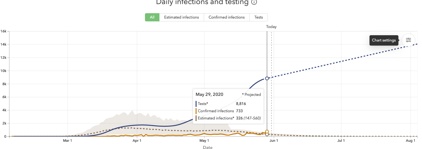
Predicted infections are actually lower than measured infections, something that would only happen due to testing lag when cases were declining significantly. This could be because their initial model fit a Gaussian curve to the data, which forced a symmetric increase and decline around a peak. While I don’t think this is their approach anymore, everything still seemed to be asymptoting towards zero when I reviewed it, so that doesn’t inspire much confidence.
The Columbia and Imperial models do a better job, but they’re not updated as frequently as I’d like. Youyang Gu’s model is updated daily, performs really well in predictions, and has good reviews from subject matter experts, so I decided to use it. But I still wanted to do a few checks to validate it. First, I compared it to Imperial College’s model:
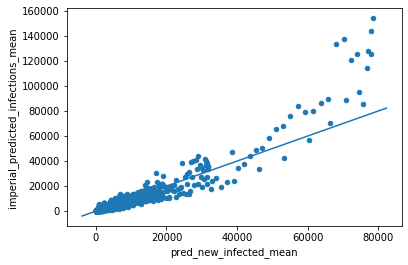
If they agreed perfectly, their estimates would sit on a 45 degree line. So there’s some deviation, especially in the high case counts. One way to quantify this deviation is using a concordance correlation coefficient, which ends up being 0.917. Perfect concordance would give a value of 1.0, so this is pretty good.
Next, I compared it against recent serology tests in Spain, which suggests 5% of the population has been infected so far. If we just sum up the reported case counts as of 5/13/2020 and divide by the Spanish population, it gives an estimated percent infected of 0.5%, which is a 10x undercount. But if we sum up the predicted infections from Youyang’s model and divide by the population, we get an estimated 6.7% of the population infected. So this is at least at the right order of magnitude, and could be correct depending on when the serology study actually ended.
New York state also completed a serology study on April 23rd that estimated a New York City infection rate of 21.2% and a statewide rate of 13.9%. The model predictions of 20.9% in the city and 12.5% statewide as of 4/23/2020 are quite close. So overall this seems like a quality model and I’ll probably continue using it.
Update: After observing these probabilities for the past few weeks, one thing I’ve noticed is that even these tend to lag during a new outbreak. I think this is because the model does a grid search and finds the optimal model paramaters that minimize the error on the deaths timeseries. But if these parameters are optimized to match the death timeseries from a month ago, running the model forward to today will still underestimate the cases during an exponential growth phase because it’s using old parameters.
Another interesting problem with this approach is that if the pandemic starts spreading more in young populations like it did recently, you’ll underestimate the actual number of cases because the deaths timeseries won’t be increasing as much. I’m not sure how to fix these issues, but what’s really needed is a robust way to estimate total cases using the current cases timeseries. Let me know if you’re aware of an epidemiologist that’s doing this!
References
[1] COVID-19 Projections Using Machine Learning. https://covid19-projections.com/about/
[2] Communicating the Risk of Death from Novel Coronavirus Disease (COVID-19). https://www.ncbi.nlm.nih.gov/pmc/articles/PMC7073841/
[3] COVID-19 Pandemic Planning Scenarios. https://www.cdc.gov/coronavirus/2019-ncov/hcp/planning-scenarios.html
[4] Variation in False-Negative Rate of Reverse Transcriptase Polymerase Chain Reaction–Based SARS-CoV-2 Tests by Time Since Exposure. https://www.acpjournals.org/doi/10.7326/M20-1495
[5] Using a delay-adjusted case fatality ratio to estimate under-reporting. https://cmmid.github.io/topics/covid19/global_cfr_estimates.html
[6] Inferring cases from recent deaths. https://cmmid.github.io/topics/covid19/cases-from-deaths.html
[7] Coronavirus Case Counts Are Meaningless. https://fivethirtyeight.com/features/coronavirus-case-counts-are-meaningless/
[8] Reich Lab COVID-19 Forecast Hub. https://reichlab.io/covid19-forecast-hub/
[9] Where The Latest COVID-19 Models Think We’re Headed — And Why They Disagree. https://projects.fivethirtyeight.com/covid-forecasts/
[10] The results of a Spanish study on Covid-19 immunity have a scary takeaway. https://www.vox.com/2020/5/16/21259492/covid-antibodies-spain-serology-study-coronavirus-immunity
[11] Online COVID-19 Dashboard Calculates How Risky Reopenings and Gatherings Can Be. https://blogs.scientificamerican.com/observations/online-covid-19-dashboard-calculates-how-risky-reopenings-and-gatherings-can-be/
[12] COVID-19 Event Risk Assessment Planning tool. https://covid19risk.biosci.gatech.edu/