It’s been a little while since the 2020 elections so I finally got around to evaluating my election model. I’m hoping to run a similar model in the future, so this post is an attempt to learn what worked and what didn’t so I can improve on it next time. If you haven’t read my initial post on the subject, that will provide helpful context (especially the “How it Works” section).
Overall, I think my model performed pretty well and it was correct to focus on the Senate in the final weeks of the campaign. But systematic polling bias against Republicans made it really tough for anyone to accurately estimate Democratic win probabilities. This led to a situation where the rank order of the power values was correct (in my opinion), but their magnitudes were off due to polling error.
This evaluation is organized into three parts. First, I compare the actual vs. projected results and calculate the forecasting error for each office. Next, I evaluate my approach for combining the projections by rerunning the models centered on the actual election outcomes. Finally, I compare these model priorities to the revealed preference of donors via campaign spending to get an objective measure of its performance.
Forecasting Error
My model relies on a variety of different forecasts, ranging from simple judgment based ratings to complex quantitative forecasts. For the presidency, I relied on the Economist’s forecast which describes it’s methodology here. I used Cory McCartan’s forecast for the Senate, described here. For the rest of the legislative bodies, I quantified categorical ratings from Inside Elections and CNalysis using 538’s categories, and then sampled around those ratings using normal distributions to create basic forecasts.
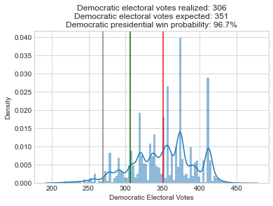
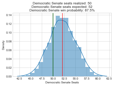
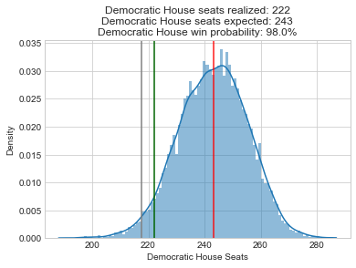
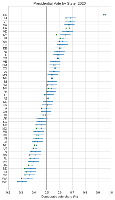
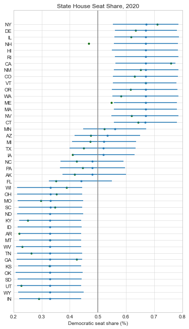
Below, I recreated all of my pre-election plots with the actual results superimposed in green. At just about every level, the forecasts were biased in favor of Democrats:
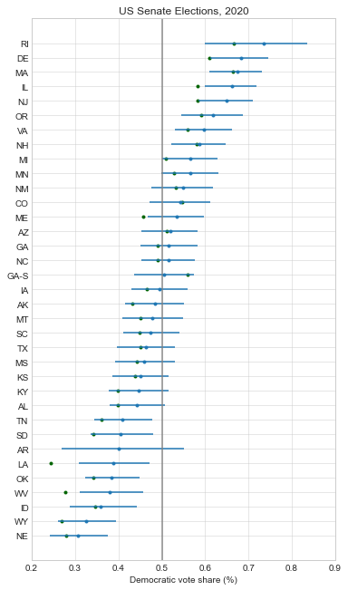
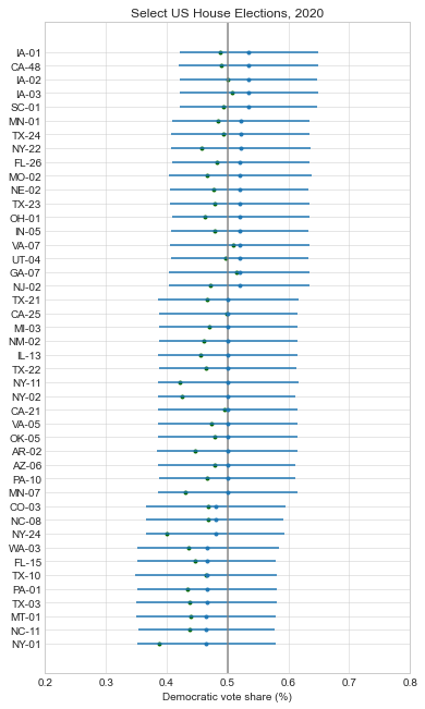
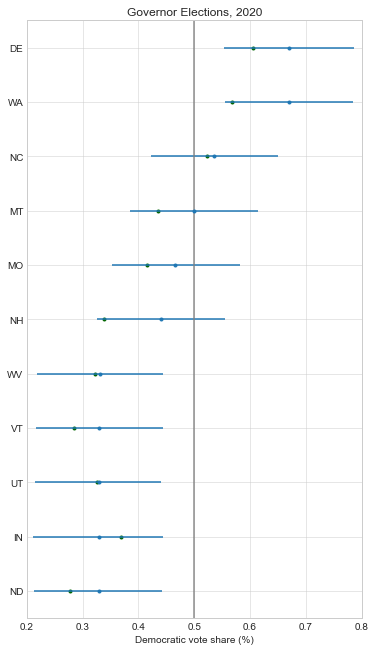
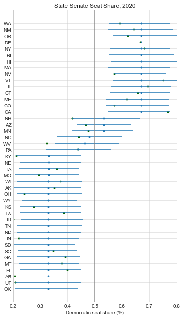
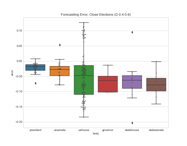
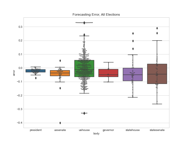
Here is a boxplot of the error by legislative body. Note that I’m only displaying the error for the elections that had close results (Democratic projected or actual voteshare of 40-60%). I explain more in appendix A below, but my model only needs accurate estimates for close elections so that’s my focus.
And here’s a summary table showing the mean error (a measure of bias), and the mean absolute error for each office.
So the presidential and Senate forecasts were biased in favor of Democrats by about 2%, but overall these offices had the least amount of error (their sophisticated methods helped!). The House was a little more mixed, with a bias of 4.9% towards Democrats, and a very large absolute error of 8%. And the state legislative estimates of Democratic seat share had the most pro-D bias (7%) and the most absolute error.
I think my main takeaway from this is that I need to come up with a better method of quantifying the categorical ratings. I used 538’s quantifications that were based on the historical performance of a number of different election ratings, but I probably need to use conversions tailored to the specific Inside Elections and CNalysis ratings I used instead. In some sense I’d expect the performance at the state level to be worse than the federal level because there’s much less polling and scrutiny of those elections, but I hoped to do a little better than this.
But coming up with better categories won’t do much to fix biases in the polling. Polling error seems to be the core reason that many of the forecasts, both quantitative and categorical, were off. And partisan nonresponse bias was probably the major source of polling error, so fixing this bias needs to be the focus of anyone hoping to forecast elections in the future.
Model Error
So how would my model perform if we had near perfect forecasts? One way to test this is to center the probability distributions for all the elections at the actual outcomes, and then rerun my model to see what it prioritizes. That’s exactly what I do below. Note that I didn’t have access to the underlying source code for the Economist’s forecast (and don’t understand McCartan’s Senate forecast well enough), so I had to rewrite my own Senate and presidential models. Here are summary histograms for the new presidential, Senate, and House simulations:
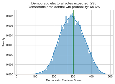
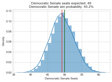
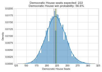
So rerunning these models leads to a pretty dramatic shift in the histograms and Democratic win probabilities compared to the initial results. These legislative bodies that were highly likely to go to Democrats are now essentially tossups.
How does this influence the priorities of my model? Just as a reminder, here is how the realized power value is calculated: realized_power = potential_power * pr_close * pr_tip. So the shifts in the probability distributions above will affect the pr_close variables for each legislative body, and the changes in the expected outcomes for the individual seats will change their tipping point probabilities (pr_tip).
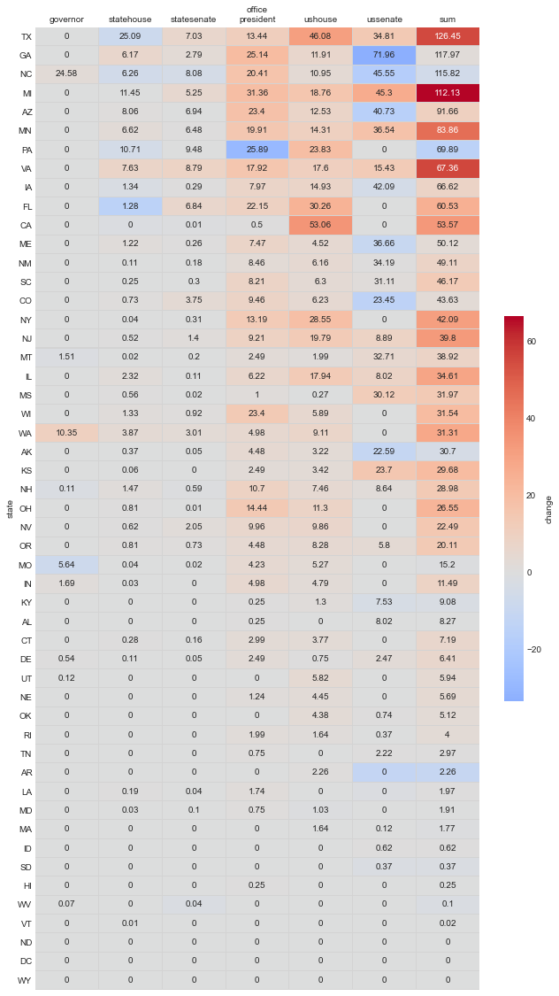
Here’s a table showing the results for each seat and the sum by state. The color coding communicates the change from the original 2020 model:
Here are the resulting values grouped by office, and the change:
So the Senate has a similar power value as in the initial model, but relative importance of House and presidency have increased dramatically (3x). I find this result really interesting because the Senate histogram shifted just as much as that of the House and presidency. But because it shifted from one side of center to the other, the integrated value of pr_close around the center didn’t change very much. So I guess this could be interpreted as saying that the Senate races are still the most important, but you need to increase the resources put into the House and presidency relative to the Senate if the current allocation of funds are out of line with this model. But how do these numbers compare to the actual priorities of campaign funders?
Revealed Preference
In some sense, my model is subjective (I choose the potential_power values for each office), so any evaluation will also be subjective. But there might be one objective measure of priorities that I can compare against: campaign funding. Maybe the wisdom of the crowds revealed through campaign donations can show us what our true priorities should be (assuming the crowds aren’t irrational or influenced by bad polling). So below I compare the percentage of power held by each office in the original 2020 analysis, the new recentered model, and the actual funding allocations.
I’m actually fairly surprised at the agreement here, at least for the downballot races. But there are major disagreements when it comes to the presidency and the Senate, and the original model magnifies this difference due to polling error. Here are a few reasons the estimates might not agree when it comes to the presidency:
- Donors were being irrational, and the correct thing to do was to donate more to the Senate races.
- Donors were being rational, and the downside of another Trump term was so large that they were correct to focus on the presidency. Put another way, the
potential_powervalues in my model were wrong. - There might be certain fixed costs for running a national presidential race that make it naturally more expensive.
- Donors are “buying” power over the Senate for 2 years, but the presidency for 4. And they are only buying 1/3 of the Senate, but the full presidency.
I’m not sure which of these explanations (if any) is correct, but I clearly need to do more thinking about what the exact implications of my model are for campaign funding.
Conclusion
- Polling (and forecasts) were systematically biased against Republicans, probably due to partisan nonresponse bias. Using wide probability distributions can only do so much to fix this problem.
- I need to come up with more systematic way of quantifying categorical ratings.
- I need to think more deeply about what the implications of the model are for campaign funding.
- Overall, I think the model was right to put an emphasis on the Senate in the end. Especially considering that 13k vote switches towards David Perdue in the Georgia Senate race would have prevented a runoff and denied Democrats unified control of the federal government. But while the rank order of the power values was probably correct, their magnitudes were off due to polling error. Finding a way to fix partisan nonresponse bias will be a major focus of pollsters and anyone else trying to forecast elections in 2022 and beyond.
Appendix A: All the Forecasting Error
Why did I only focus on the forecasting error for close elections? The main reason is that the error for blowout elections doesn’t matter very much – I just need to shift the seats far enough away from the center that they have low tipping point probabilities (or low pr_close when it comes to state legislatures). So it doesn’t make much difference if I estimate Democratic vote share at 30, 20, or 10% in these cases because their resulting realized_power values will be near zero regardless.
But here are the forecasting errors for all the elections for the sake of completeness:
And here are some summary statistics for the graphic above. Interestingly, the mean error terms are smaller for the entire sample because the errors on both sides cancel out. But the absolute error values are still pretty similar:
References
[1] Post Code and Data: psthomas/elections-meta. https://github.com/psthomas/elections-meta
[2] Original post: Combining the 2020 Election Models. https://pstblog.com/2020/09/09/elections-meta
[3] Simple presidential model. Drew Linzer. https://twitter.com/DrewLinzer/status/1293216060456329216
[4] Poll-Based Election Forecasts Will Always Struggle With Uncertainty. Natalie Jackson. https://centerforpolitics.org/crystalball/articles/poll-based-election-forecasts-will-always-struggle-with-uncertainty/
[5] Don’t kid yourself. The polls messed up—and that would be the case even if we’d forecasted Biden losing Florida and only barely winning the electoral college. Andrew Gelman. https://statmodeling.stat.columbia.edu/2020/11/04/dont-kid-yourself-the-polls-messed-up-and-that-would-be-the-case-even-wed-forecasted-biden-losing-florida-and-only-barely-winning-the-electoral-college/
[6] Many Are Afraid To Say It, but This Is Not a Close Race. Charlie Cook. https://cookpolitical.com/analysis/national/national-politics/many-are-afraid-say-it-not-close-race
[7] One pollster’s explanation for why the polls got it wrong. Dylan Matthews. https://www.vox.com/policy-and-politics/2020/11/10/21551766/election-polls-results-wrong-david-shor
[8] Memo: 2020 Polling Retrospective. Data For Progress. https://www.dataforprogress.org/memos/2020-polling-retrospective
[9] 2020 Senate Forecast. Cory McCartan. https://corymccartan.github.io/projects/senate-20/
[10] Inside Elections House Ratings. Nathan Gonzales. http://insideelections.com/ratings/house
[11] Inside Elections Governor Ratings. Nathan Gonzales http://insideelections.com/ratings/governor
[12] CNalysis State Legislature Ratings. Chaz Nuttycombe. https://www.cnalysiscom.website/