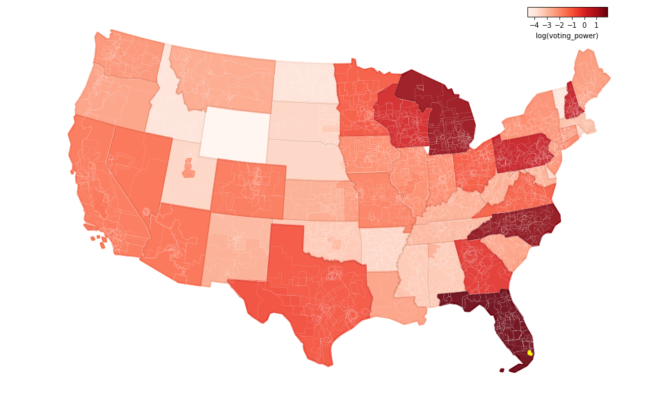
It’s difficult to get a broad mental overview of politics in the United States. There are so many elections covering different districts and each office holder has a different level of influence over policy outcomes. This post is an attempt to help simplify things by bringing all the federal and state level election results together into one place. I then use an approach described below to combine all the results into a single voting power metric for each location. The end result is a map that shows the cumulative political influence of the voters in each place:
Here are the main takeaways from this analysis:
- We should pay more attention to races for governor. Governors probably collectively wield as much power as the president, but their elections don’t get anywhere near the same level of attention.
- Voting power within states is eroded by the fact that 40 percent (!) of the candidates for state legislature run unopposed. This is probably a symptom of overly gerrymandered state districts.
- Voters in FL, NC, MI, PA, NH, WI and GA are especially powerful, mainly because they participated in close elections for president and governor.
- By this metric, the most powerful location during the past election cycle was a western suburb of Miami.
All the code and most of the data for this post are available on GitHub here. This analysis builds on my earlier post covering voting power at the presidential level but it’s more comprehensive because it includes the often-ignored state level elections.
The Power Sharing Model
It seems to me that at least two things influence the political power of a voter:
- Their ability to change election outcomes. If there’s no chance a voter will swing an election, voting is pointless.
- The power held by their elected officials. Voters are powerless if their representatives can’t influence policy.
So I build off these two concepts to come up with the voting power metric below.
The first step is to allocate potential power to each seat in the government. I start out with an arbitrary 100 points of power, and allocate half to the federal government and half to the states. The power at the federal level is then further subdivided between the president (25) and congress (25), with the house and senate dividing the congressional power evenly. The other 50 points of power are divided between the states according to their fraction of the national population. Each state’s value is then split between the governor and state legislature just like at the federal level. The end result is a potential power value for every seat of the state and federal government (judiciary excluded).
The second step is to calculate a realized voting power value for each seat. To do this, I need a way to combine the power value from above with the election margin. The most obvious way is to divide them so that the power of the seat increases as the margin gets closer to zero. Here’s the equation:
voting_power = seat_potential_power/percent_absolute_marginSo the closer the election, the higher the voting power value. One thing to note here that the voting power of a seat doesn’t have a ceiling – an election for state legislature could exceed the power of the presidential vote if the margin is close enough. (Actually, there is a ceiling but it’s just really high. For example, if an election is won by a single vote, voting_power = seat_potential_power*(n/100), where n is the total number of voters in the election.)
Summary Statistics
So after the theory above, what do these values look like if they’re actually calculated out? After a lot of data wrangling, I was able to compile results for almost all the state and federal seats in the past election cycle (a cycle here is defined as the time for every seat to be replaced once). Here’s the distribution of voting power values overall:

Looking at the overall distribution above, it’s clear the values follow something more extreme than a lognormal distribution. The individual distributions below show that the federal elections outperform the state level elections with the exception of the governor’s races.

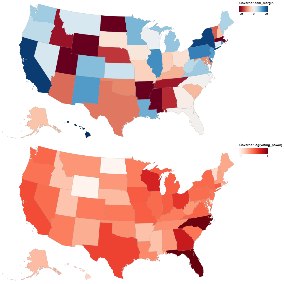
The table below shows the sum of voting power by office type. Looking at the sum_power column, voters for the governor, president, US congress and state legislature races all have the same amounts of theoretical power (the small differences are due to missing election data). But when you look at the realized sum_voting_power column, the high mean absolute margins erode the potential power for the state legislatures especially.
| mean_abs_margin | sum_power | mean_dem_margin | sum_voting_power | |
|---|---|---|---|---|
| governor | 14.157078 | 24.946323 | -3.274936 | 10.740176 |
| president | 18.380372 | 25.000000 | -3.674600 | 9.040410 |
| ussenate | 21.055863 | 12.500000 | -1.019923 | 3.414887 |
| ushouse | 30.623423 | 12.385057 | 7.662104 | 1.702852 |
| statesenate | 52.964234 | 11.785348 | -6.824567 | 1.048945 |
| statehouse | 54.282532 | 11.780629 | -4.403811 | 0.949632 |
It’s also interesting to note that votes for governor have more cumulative power than votes for president because the elections are closer. This doesn’t strike me as obviously false, but it’s worth considering whether or not this reflects reality.
Results by Office
Next I thought it would be interesting to show detailed maps of the results for each level of government. I find these maps pretty interesting because I’ve never seen all of them together in one place before.
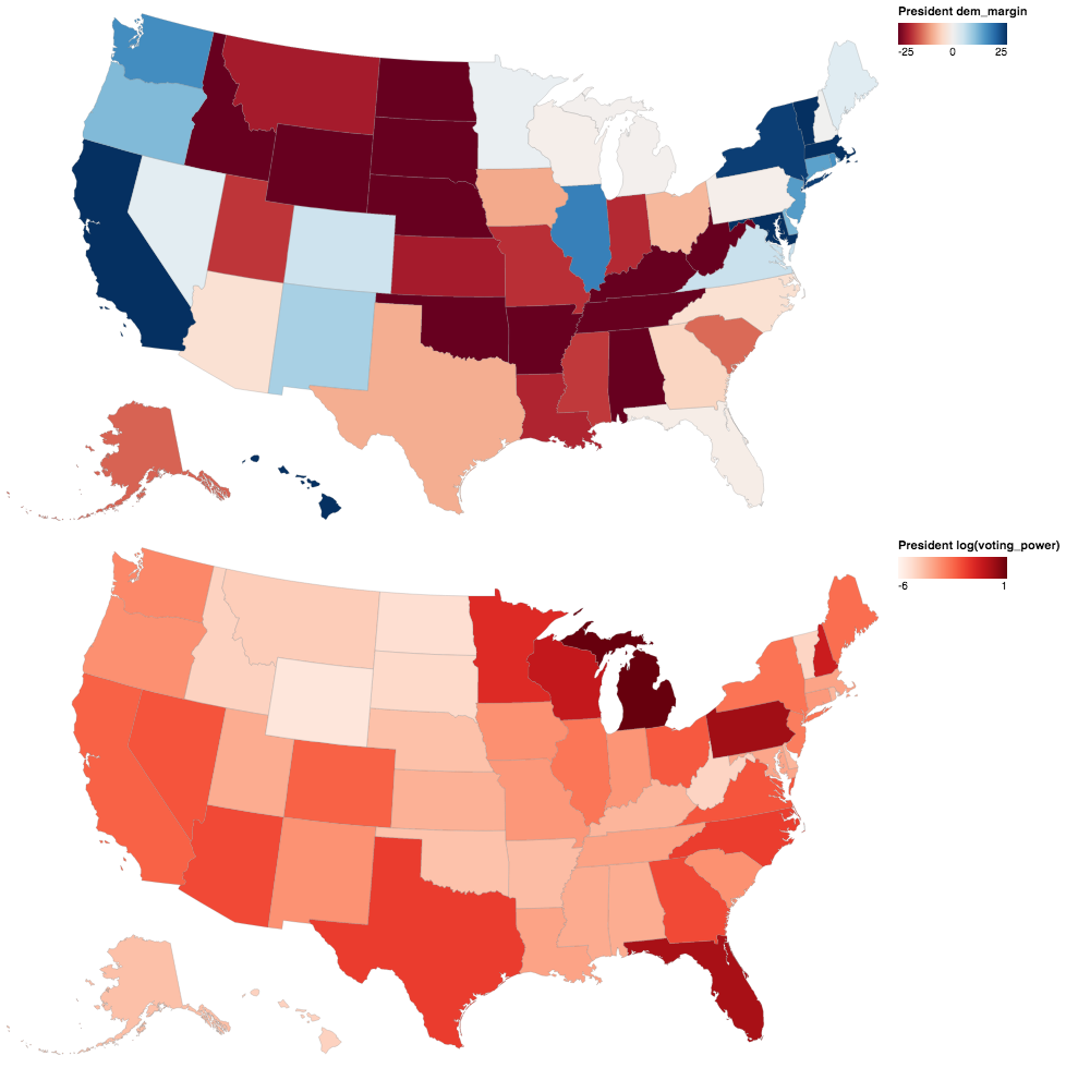
President
Most people are probably familiar with the first map, the 2016 election results. The source is the MIT Election Labs presidential dataset. One interesting thing to note is that the democratic margin and voting power maps are pretty much inverses of each other – places with extreme margins have low voting power. This is a pattern that repeats itself for the remaining maps as well. Also note that I take the log of the voting power values to better display the variation in the plots below.
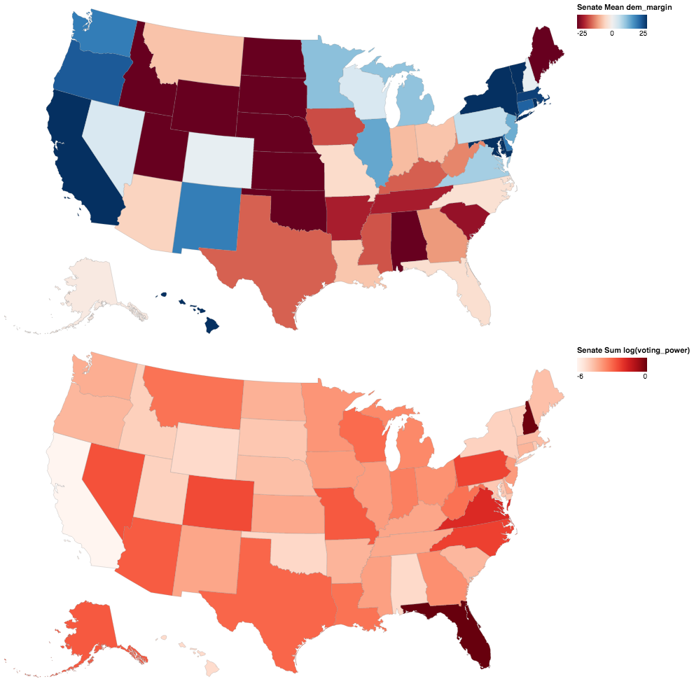
US Senate
Next are the senate results by state from the MIT Election Labs senate dataset. The democratic margin value is the average of the two senate races, while the voting power value is summed across both elections. The dates of these senate races range from 2014-2018 because elections are staggered with 1/3 of senate seats up for election every 2 years.
US House
Next are the house results, also from the MIT Election Labs. Note that some elections (e.g. Minnesota) don’t follow a traditional Democratic/Republican divide for the margin calculation, but I am still able to calculate the voting power value for those districts by calculating the absolute margin between the top two candidates. All of these results are from 2018.

Governors
The data for the governors races are from David Leip’s Election Atlas, covering the most recent result for each state. It’s interesting to note the difference in margins between this map and the presidential map above. Being able to tailor a candidate to each state’s race for governor seems to lead to closer margins than having a single candidate for president.
State Senate
Finally, the results for the state legislatures. The data are from Carl Klarner’s state legislative dataset, which covers results through the 2016 elections. The legislative district boundaries are from the 2018 Census Tiger Geodatabase. There are some missing results, mainly from NE, LA, OK and AR. Nebraska is missing from both the Senate and House results because its legislature is unicameral and their elections are technically nonpartisan.
These maps are really interesting, mainly because I’ve never seen them before. I think the main point of interest here is how extreme the margins are, which results in small the voting power values. One major reason for this is that roughly 40 percent of the candidates for state office run unopposed, so their elections have margins of 100 percent. This could be a symptom of gerrymandering where cracked districts would have close margins and packed districts would have blowout margins. But it could also just be a symptom of the geography of the state in some cases.
State House
Here are the state house results, with Carl Klarner’s dataset from above as the source. These results overall seem to be very similar to the Senate results above, just more detailed because there are more seats.

Combined Results
It’s a little overwhelming to see all these results at once. Below I try to simplify things by combining them, first by summing the results by state and then by overlaying and merging all the districts together. Here is the first map, which is just a sum of the voting power values by state. Florida, North Carolina, and Michigan are the top performers here:
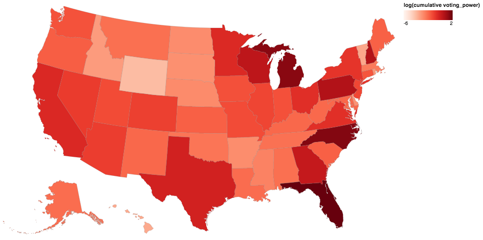
Here’s a table summary of the above map:
| state_abbr | state_fips | voting_power | |
|---|---|---|---|
| 9 | FL | 12 | 6.551916 |
| 27 | NC | 37 | 4.105122 |
| 22 | MI | 26 | 3.660639 |
| 38 | PA | 42 | 1.575222 |
| 30 | NH | 33 | 1.523800 |
| 48 | WI | 55 | 1.192909 |
| 10 | GA | 13 | 1.001493 |
| 43 | TX | 48 | 0.680421 |
| 4 | CA | 6 | 0.521339 |
| 23 | MN | 27 | 0.513667 |
| 35 | OH | 39 | 0.431217 |
| 45 | VA | 51 | 0.422264 |
| 34 | NY | 36 | 0.364836 |
| 33 | NV | 32 | 0.306071 |
| 3 | AZ | 4 | 0.290053 |
| 5 | CO | 8 | 0.272018 |
| 14 | IL | 17 | 0.241070 |
| 31 | NJ | 34 | 0.231329 |
| 44 | UT | 49 | 0.208606 |
| 24 | MO | 29 | 0.207401 |
| 12 | IA | 19 | 0.185651 |
| 15 | IN | 18 | 0.182072 |
| 47 | WA | 53 | 0.173504 |
| 6 | CT | 9 | 0.163913 |
| 37 | OR | 41 | 0.131566 |
| 16 | KS | 20 | 0.127854 |
| 40 | SC | 45 | 0.127477 |
| 21 | ME | 23 | 0.124064 |
| 17 | KY | 21 | 0.106102 |
| 20 | MD | 24 | 0.105236 |
| 32 | NM | 35 | 0.104684 |
| 49 | WV | 54 | 0.101614 |
| 18 | LA | 22 | 0.094424 |
| 0 | AK | 2 | 0.092161 |
| 26 | MT | 30 | 0.087219 |
| 1 | AL | 1 | 0.086837 |
| 42 | TN | 47 | 0.083975 |
| 36 | OK | 40 | 0.076436 |
| 19 | MA | 25 | 0.065192 |
| 25 | MS | 28 | 0.054925 |
| 29 | NE | 31 | 0.044191 |
| 28 | ND | 38 | 0.042327 |
| 2 | AR | 5 | 0.041736 |
| 41 | SD | 46 | 0.038921 |
| 8 | DE | 10 | 0.036613 |
| 39 | RI | 44 | 0.033107 |
| 13 | ID | 16 | 0.028847 |
| 46 | VT | 50 | 0.021205 |
| 11 | HI | 15 | 0.019575 |
| 50 | WY | 56 | 0.012467 |
| 7 | DC | 11 | 0.001613 |
And here are the top offices from the leading states. The min_abs_margin column is the margin of the closest race for each seat, which is probably responsible for most of the voting_power value. Generally, governors or presidential votes seem to be driving the scores, but not always (e.g. NH):
| state_abbr | state_power | office | power | min_abs_margin | voting_power |
|---|---|---|---|---|---|
| FL | 6.551916 | governor | 1.627555 | 0.394900 | 4.121436 |
| president | 1.347584 | 1.198626 | 1.124274 | ||
| ussenate | 0.125000 | 0.122503 | 1.036689 | ||
| statehouse | 0.006796 | 0.084434 | 0.123028 | ||
| ushouse | 0.028736 | 0.874615 | 0.111829 | ||
| statesenate | 0.020388 | 3.258565 | 0.034659 | ||
| NC | 4.105122 | governor | 0.793448 | 0.218148 | 3.637197 |
| president | 0.697026 | 3.655229 | 0.190693 | ||
| ushouse | 0.028736 | 0.320108 | 0.114202 | ||
| ussenate | 0.125000 | 1.564446 | 0.101845 | ||
| statehouse | 0.003313 | 0.383575 | 0.037828 | ||
| statesenate | 0.007952 | 0.890182 | 0.023357 | ||
| MI | 3.660639 | president | 0.743494 | 0.223033 | 3.333558 |
| statesenate | 0.010072 | 0.075871 | 0.153072 | ||
| governor | 0.763823 | 9.567130 | 0.079838 | ||
| ushouse | 0.028736 | 3.834388 | 0.035380 | ||
| statehouse | 0.003479 | 0.593936 | 0.030168 | ||
| ussenate | 0.125000 | 6.505602 | 0.028623 | ||
| PA | 1.575222 | president | 0.929368 | 0.724270 | 1.283180 |
| ussenate | 0.125000 | 1.432453 | 0.096975 | ||
| statehouse | 0.002416 | 0.068476 | 0.065791 | ||
| governor | 0.978632 | 17.072299 | 0.057323 | ||
| ushouse | 0.028736 | 2.519118 | 0.049276 | ||
| statesenate | 0.009807 | 2.724007 | 0.022677 | ||
| NH | 1.523800 | ussenate | 0.125000 | 0.137592 | 0.947011 |
| president | 0.185874 | 0.367596 | 0.505647 | ||
| statesenate | 0.002164 | 0.061277 | 0.040793 | ||
| governor | 0.103652 | 7.044083 | 0.014715 | ||
| statehouse | 0.000130 | 0.137468 | 0.010124 | ||
| ushouse | 0.028736 | 8.551431 | 0.005511 | ||
| WI | 1.192909 | president | 0.464684 | 0.764343 | 0.607952 |
| governor | 0.444235 | 1.093290 | 0.406329 | ||
| statesenate | 0.006745 | 0.070027 | 0.111116 | ||
| ussenate | 0.125000 | 3.361977 | 0.048715 | ||
| ushouse | 0.028736 | 11.005491 | 0.010840 | ||
| statehouse | 0.002248 | 2.667798 | 0.007957 | ||
| GA | 1.001493 | governor | 0.803830 | 1.389146 | 0.578650 |
| ushouse | 0.028736 | 0.149408 | 0.231010 | ||
| president | 0.743494 | 5.131343 | 0.144893 | ||
| ussenate | 0.125000 | 7.682710 | 0.025361 | ||
| statehouse | 0.002238 | 0.902439 | 0.013748 | ||
| statesenate | 0.007192 | 3.847239 | 0.007831 |
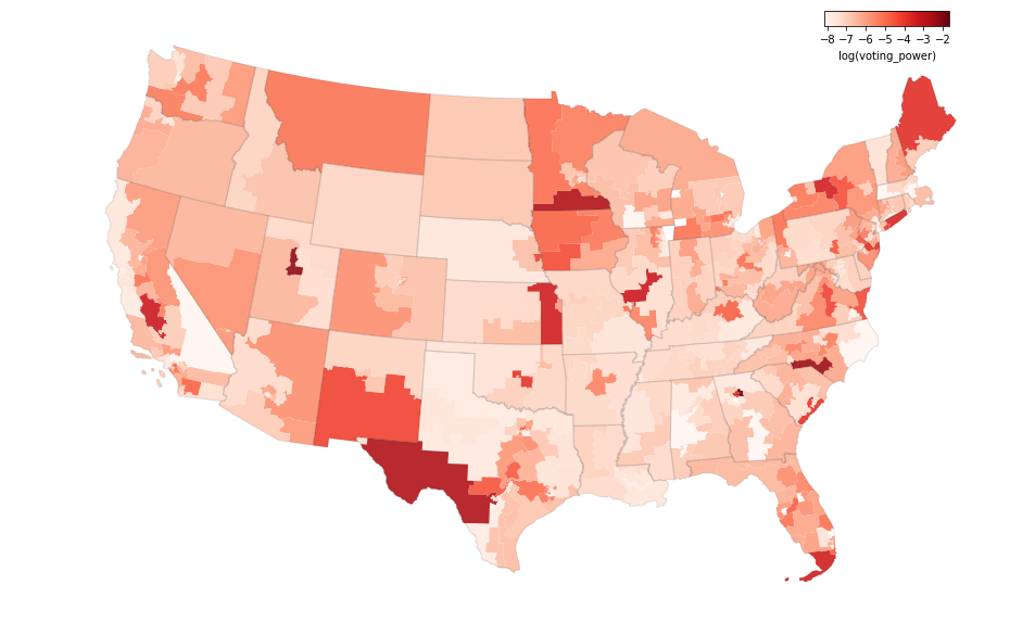
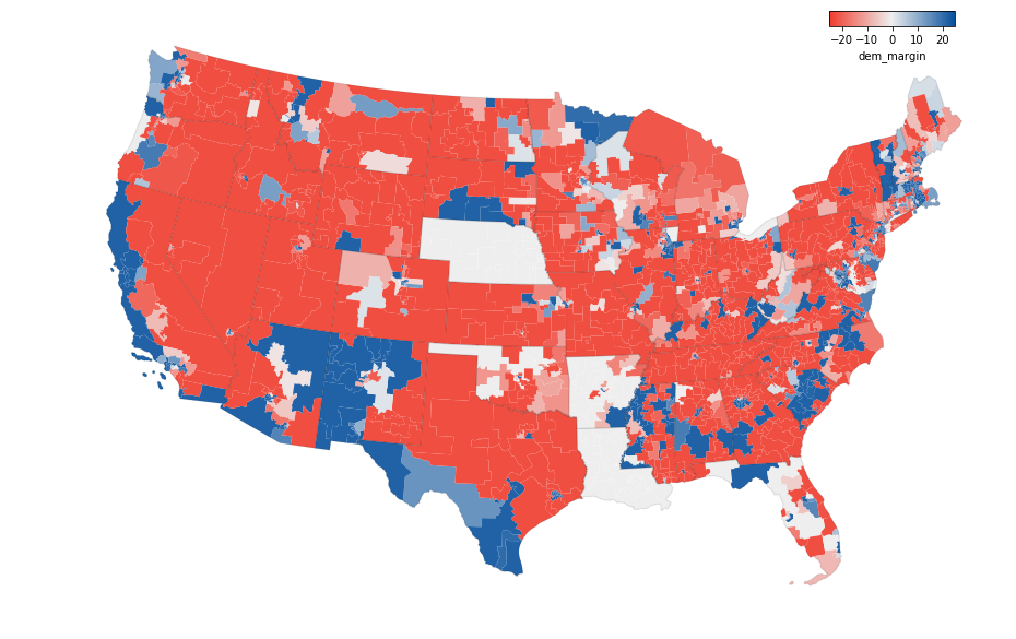
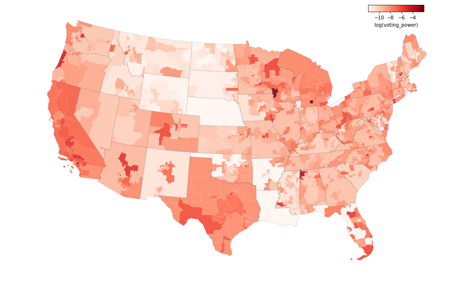
The state sums above provide a pretty good summary, but it is possible to get more detailed results by overlaying all the districts. This is done with the geopandas union function which creates unique geographies for all overlapping and non-overlapping districts. I had to simplify and buffer the district boundaries in order to get the computation to work, but the end result is still pretty interesting.
First is the average democratic margin across all elections for each location:
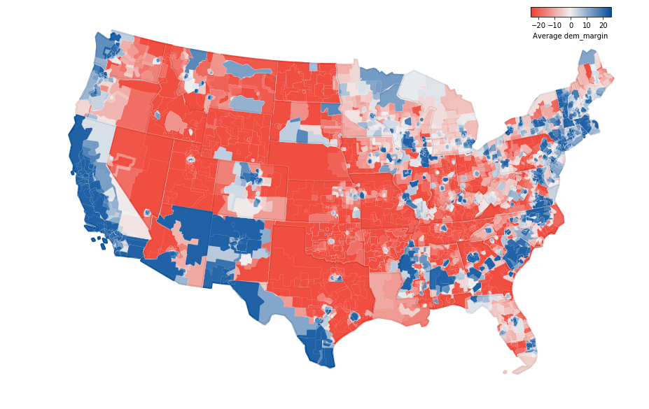
Next is the cumulative voting power value for each location. The small white lines on the map outline unique districts with their own voting power values. Even though there’s much more detail, this map doesn’t look very different from the map above that shows sums by state. This is because elections that follow state boundaries (e.g. governor/president/senate) drive the voting power values, so the differences between states are greater than the within state differences in most cases.
I was expecting this map to show a lot more within state variation, but instead it emphasizes the statewide elections. This is because the statewide offices are generally more powerful and the margins of those elections tend to be closer.
Model Problems
Here are a few potential problems I can think of with the above analysis:
- Sensitivity: It’s possible that these results are too sensitive to the outcome of a single election. I try to include as many elections as possible to counteract this, but the power values are still driven by the races for governor and president.
- Excluded elections: Judiciary and local government elections are left out of this analysis.
- Calculations: The power distribution and voting power calculations make a lot of assumptions which might not be true. It’s possible that a different method of combining or normalizing the inputs would lead to better results.
- Past results aren’t indicative of the future: The high power values might just be driven by random variation in election margins and not say anything intrinsic about a place.
- Legislative Control: The threshold for flipping control of a legislative body matters too. You don’t have much power if you participate in close elections but there’s no chance for your party to ever take the majority. My 2020 elections model fixes this problem by taking tipping point thresholds into account, so that might be worth a look too.
Even with these concerns, I think the analysis above provides some useful insights. All the code for this project is available on GitHub, so I’d welcome any comments or contributions to make it better. There are probably other interesting analyses I could do with this dataset, so stay tuned for future posts on this subject.
References
[1] MIT Election Labs Data. All Data, President, US Senate, US House.
[2] David Leip’s Election Atlas, Governor Results. https://uselectionatlas.org/.
[3] State Legislative Election Returns, 1967-2016: Restructured For Use. Carl Klarner. https://dataverse.harvard.edu/dataset.xhtml?persistentId=doi:10.7910/DVN/DRSACA.
[4] US Census Bureau Tiger Geodatabase, 2018 Legislative Areas National Database. https://www.census.gov/geo/maps-data/data/tiger-geodatabases.html#tab_2018.
[5] Code and data for this post: voting-power-comprehensive repo. https://github.com/psthomas/voting-power-comprehensive.