My election model from 2020 did a pretty good job of focusing on critical states, so I decided to do something similar for the midterms this year. The general idea for this project is to combine forecasts for elections at every level of government into an index, which can then be used to prioritize campaign efforts.
This index takes into account things like the baseline political power held by a legislative body, how close the race will be for partisan control, and the tipping point probabilities for individual seats. I’ve made a number of improvements this year, including a better approach to quantifying categorical ratings and an adjustment for election frequencies. If you want more information on the details of the model, take a look at the “How it Works” section below. Otherwise, here are the results for 2022.
Election Forecasts
This year, I use FiveThirtyEight’s forecasts for the US House, Senate, and Governors races along with Louis Jacobson’s state legislative ratings. FiveThirtyEight does a good job of making their forecasts and histograms available on their website, so I just have to do some post-processing to incorporate their results.
It was a little more complex to quantify Louis Jacobson’s categorical ratings, but I was able to do so by comparing his historic ratings with the actual election outcomes at the state level since 2002 (see below). This allows me to make a point estimate of the two party seat share along with uncertainty bounds for each of his categorical ratings this year.
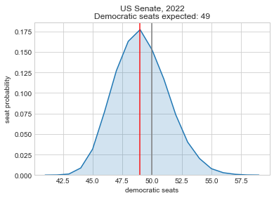
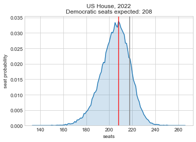
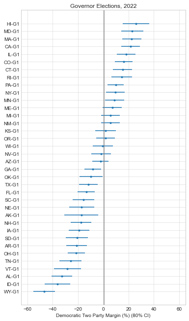
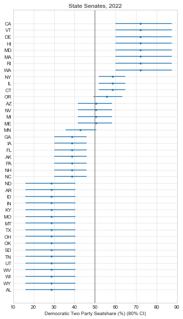
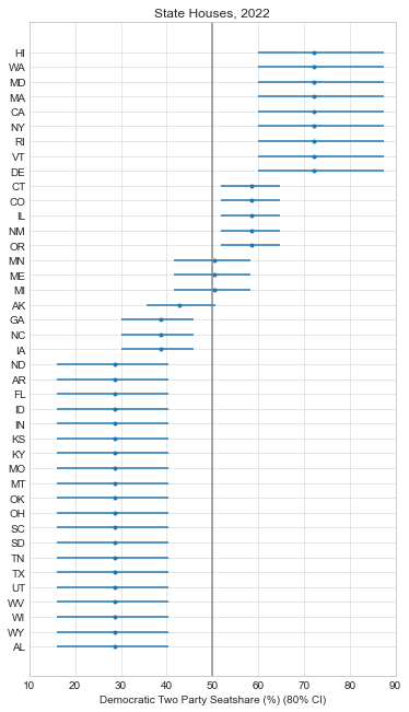
So as of writing this, it looks like it will be a tough election for Democrats. They’re unlikely to hold the House and the Senate is a tossup at this point. This is actually a better outcome than most expected a few months ago, so the Democratic Party at least has some positive momentum in its favor.
Power Values by State
It’s difficult to distill all of the election forecasts above into a set of priorities, but this is where my model comes in. I calculate a baseline power value for each office, then adjust it for how close the election is expected to be and how likely a seat is to be the tipping point for control if applicable. The general intuition here is that you should target elections that are likely to be close, and target legislative bodies where a change in partisan control is more likely.
So here are the resulting power values, grouped by state and office. Note that table is sortable, and you can adjust the weights if you prefer. By default I give equal weights to the state and federal governments. The results for each individual election are available here. Note that all the power values in the table below are just multiplied by 100 to make it easier to read.
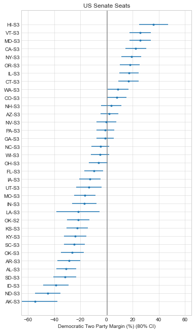
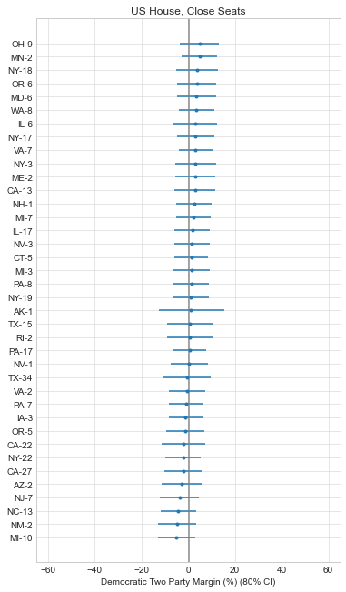
Aggregating these values at the state level makes sense to me because that’s the level that many of these elections are held. Whether you’re focused on persuading or turning out voters, you want to do it in a place where their vote counts across many close, important elections. This is currently the case in GA, PA, NV, AZ, WI – mainly driven by their races for governor and US Senate.
Funding Comparison
This model is subjective so it’s hard to evaluate the performance, but one objective measure of our priorities is the level of funding each campaign receives. Maybe the wisdom of the crowds revealed through campaign donations can show us what our true priorities should be (assuming the crowds aren’t irrational or influenced by biased polling). So below I compare the percentage of power held by each office in my analysis with the actual funding allocations [7, 8]. The funding gap is the difference between the model priority and the fraction of election funding spent on the legislative body up to this point (a positive number is a bigger gap).
So it seems like the Senate races are actually underfunded relative to what my model predicts. As an outsider in his armchair, this seems like a misallocation but here are a few potential reasons for the difference:
- There might be a baseline fixed cost to running a campaign, and there are 435 House races compared to ~33 in the Senate.
- This isn’t all the funding, just publicly disclosed funding. Maybe the undisclosed money is allocated differently.
- Incumbency gives you a small advantage for future elections, so Dems might be playing the long game for control of the House.
- There might be diminishing returns to more funding at this point, so the fraction of funding isn’t a meaningful metric currently (I think this is unlikely).
There’s no fundamental reason my index should correlate perfectly with campaign funding – I’m just using it as a rough sanity check here. It’s interesting that these numbers are all in the same ballpark, but I would have to backtest my model against previous elections to establish a predictive relationship (assuming previous elections had the “right” priorities). But ignoring the index altogether, it’s still weird to see the expected-blowout-House getting 50% more funding that the tossup-Senate when they share similar levels of control over our government (and the Senate still controls judicial confirmations with a divided government).
Update: I recently found a few sources of campaign-level funding data, so I included a table with the funding gaps for each race below. Note that this is a sum of all the FEC/State reported funding for both primary and general election candidates because I think this is a better measure of “total effort”. As of writing this, the Senate races still seem to be the ones with the largest funding gaps.
Conclusion
So choose a state with many close, consequential elections (GA, PA, NV, AZ, WI), and find a way to volunteer or donate. My model prioritized North Carolina last election due to it’s many close elections, so I ended up volunteering with a few campaigns there. This year I think I’ll stay local to Wisconsin and focus on the races for Governor and US Senate.
Appendix A: How it Works
Here’s the general equation for calculating the power values:
realized_power = potential_power * election_frequency * pr_close * pr_tipTo calculate the potential_power values, I create a hierarchical power sharing model. I begin with an arbitrary 100 points of power, and allocate half to the federal government and half to the states. The power at the federal level is then further subdivided between the president (25) and Congress (25), with the House and Senate dividing the congressional power evenly. The other 50 points of power are divided between the states according to their fraction of the national population. Each state’s value is then split between the governor and state legislatures just like at the federal level.
The next step is to adjust this potential power value for the election_frequency of each office or political body. Here’s the general intuition: If two offices hold the same level of power over our political system, but one is decided every two years and the other every four, you should put roughly double the resources into the election held every four years. So the presidency gets a multiplier of 4, but the US Senate gets a multiplier of 2 (note that this isn’t the same thing as a term length multiplier because control over the Senate is decided every 2 years, not every 6). This is a new adjustment to the model this year, based on my evaluation of the results from 2020.
Then, I need to adjust these potential power values for how close the elections are expected to be. My approach is somewhat inspired by Andrew Gelman’s paper (PDF) that calculates the probability of a single vote swinging the election. But instead of using the probability of a tie (which doesn’t make sense for an odd number of House seats or a governor’s race), I calculate the probability of a close election (pr_close). To do this, I calculate the fraction of election forecasts that land in a 5% interval around the central outcome. This is fairly easy to do this year because FiveThirtyEight releases their model histograms and I have a large pool of historical data to work with for the state legislatures.
The final step is to calculate the tipping point probability by seat (pr_tip). For the governors races this is easy because winning the two party popular vote is the tipping point (pr_tip = 1). But for the Senate or House, some seats are much more likely to decide control than others. Luckily, FiveThirtyEight calculates these tipping point probabilities for each seat so I just use their values. At the state legislative level, I calculate two party seat share so I don’t need to estimate a tipping point probability for these (it’s set to 1).
Then I just multiply. Because these values are derived from the same initial power distribution and I use a uniform approach to adjusting them, they should be comparable across elections.
Appendix B: State Legislative Analysis
State legislative elections don’t get anywhere near the same attention from forecasters as federal elections. In the past I used some general quantifications for categorical ratings from FiveThirtyEight, and just assumed an uncertainty bound around the rating for my model. But this year I stumbled across a dataset of state election forecasts reaching back to 2002 from Louis Jacobson. This allowed me to specifically quantify what each of the forecast categories means in terms of two party seat share, and also estimate how uncertain each of those bins are based on historical data. Here’s a resulting boxplot for each of the categories:
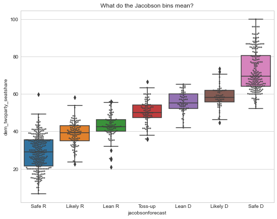
Here’s a summary table that I used to quantify this year’s forecast, estimating democratic two party seatshare:
These ratings seem to have done pretty well historically, and the quantifications follow roughly the step pattern that I’d expect. They’re not updated very often, but I think I’ll keep using them going forward. The code for the state analysis is in the repo along with the rest of the code for this project.
References
[1] Code and data for this post: psthomas/elections-meta. https://github.com/psthomas/elections-meta
[2] Original post: Combining the 2020 Election Forecasts. https://pstblog.com/2020/09/09/elections-meta
[3] FiveThirtyEight Senate/House/Governor Forecasts. https://projects.fivethirtyeight.com/2022-election-forecast/
[4] The Battle for State Legislatures. Louis Jacobson, 2022. https://centerforpolitics.org/crystalball/articles/the-battle-for-the-state-legislatures/
[5] Jacobson, Louis; Klarner, Carl; Oldham, Rob, 2020, “Louis Jacobson’s State Legislative Election Ratings (2002-2020)”, https://doi.org/10.7910/DVN/EH6LU0, Harvard Dataverse, V1.
[6] My state partisan composition dataset: https://github.com/psthomas/state-partisan-composition
[7] Federal campaign finance data, FEC. https://www.fec.gov/data/raising-bythenumbers/
[8] State campaign finance data, followthemoney.org. https://www.followthemoney.org/
[9] What is the probability your vote will make a difference? Andrew Gelman, Nate Silver. http://www.stat.columbia.edu/~gelman/research/published/probdecisive2.pdf